


IranSans
IranSans Typeface, the most widely adopted Perso-Arabic typeface in recent years, is highly favored and extensively utilized across various websites and applications, including many renowned platforms. This stylish Typeface, inspired by the classic Naskh script, seamlessly blends modern minimalism with timeless calligraphic roots.
The typeface has undergone multiple updates and improvements since 2013, with a dedicated focus on enhancing the user experience. The careful attention to detail has been a key aspect, ensuring a more refined and visually appealing design. Avoiding geometric shapes adds an organic and human touch to IranSans, creating a warm and inviting vibe. The shapes and proportions are meticulously designed to enhance readability and fluidity.


For an additional user to use the font.To share the font with your designer or project partner. (details)
For one website or app and to share the font with 2 additional project partners. (details)
For small businesses to share the font with 5 additional employees and use it on one website.(details)
For unlimited use by companies in all their activities. A website builder, website templates and services that allow users to type with the font. (details)
IranSans


Weight Variations in IranSans Typeface
IranSans consist of 11 weights. All of these weights share a common skeleton and structure, and the proportions of the characters remain consistent as the weight increases. In addition to the 11 weights, a Linked Diacritics style is also available in the IranSans(Pro) Package.
The Story of IRANSans Typeface
The IRANSans typeface made its debut during a notable period of growth for startup businesses in 2014, Positioning itself within the thriving ambitious environment of the era.
Designers working in these startup companies had a practical approach to the Perso-Arabic typeface and were more daring in using new typefaces. Therefore, the IRANSans typeface initially found its primary use in the design of websites and software for startup companies. It became a symbol of the Iranian startup business community.
Variable Fonts
Variable font is a new technology in font creation that allows you to have all weights and styles in a single font file. Variable fonts are undoubtedly the best choice for designing new websites. Using just one font file for all weights and styles results in sending only one request to your server, making page loading faster.
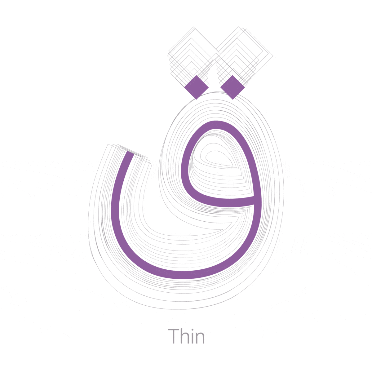
Weight: This function ranges from 100 for Thin to 1000 for Heavy, offering a spectrum that includes both the lightest and heaviest weights.
Dots: This function changes the shape of the dot characters in 9 different ways.
The precise arrangement of serifs and diacritics:
Due to typesetting constraints in early printing devices, dots tend to be placed to the right, and this convention has persisted in digital typefaces as well. In the IRANSansTypeface, dots are correctly positioned beneath the letters to which they belong. Letters like ب ب ت ت ث ث ن ن ی ی س س ش ش are part of a group with similar shapes, and the correct placement of dots is crucial for distinguishing them O. In the IRANSans Typeface, each diacritic (dot) adjusts its position based on surrounding letters, ensuring the highest aesthetics in word shapes.
In the IRANSans Typeface, dots are strategically placed in an ideal position, without causing letters to widen excessively or leaving excessive white space.
Changing Vertical Alignment of Numbers
Using IRANSans, you can use OpenType features to change the vertical alignment of numbers. (Sample CSS, HTML files, and a guide are available in the package.) With this feature, you can position numbers lower than the baseline of characters.
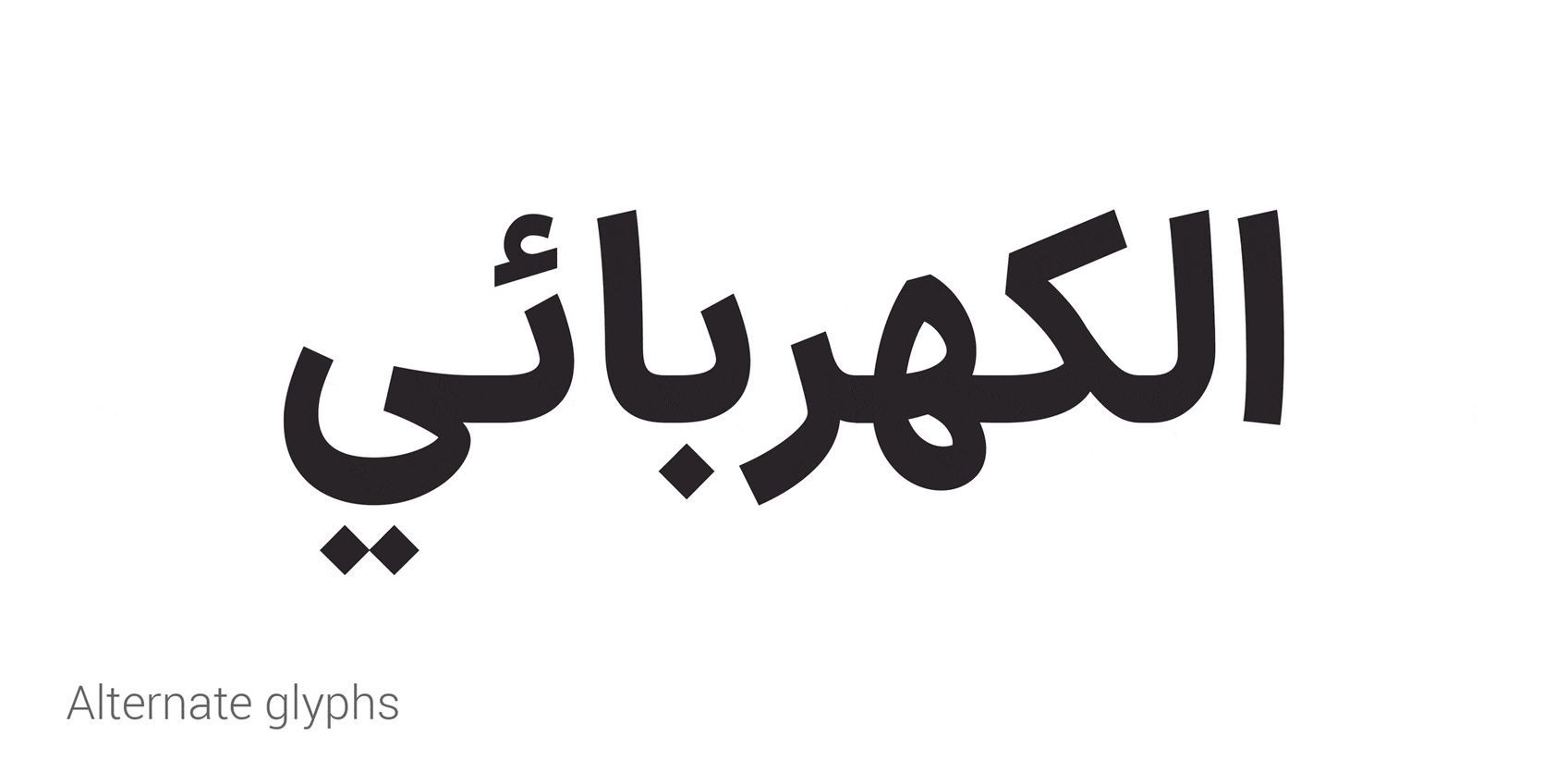
Stylistic Alternates Letters
Many alternate replacements for letters in fonts, such as ﮧ, ﮩ in the Nastaliq style, and ے in the reversed form, are available in the IRANSans Typeface
IRANSans Typeface for Arabic, Kurdish, and Urdu.
simpler, more familiar, more readable
The main reason for the popularity of the IRANSans font among Iranian designers and users is its readability. Dr. Hossein Samani conducted a study titled "Comparison of Absolute Threshold of Readability Among Ten Persian Fonts in RSVP Reading" in which he examined ten commonly used Persian fonts in a controlled environment and among them, the IRANSans font scored the highest.
IRANSans font has been able to achieve better readability for three main reasons:
- Familiarity: IRANSans Typeface is easily accepted by users. Despite its modern and contemporary appearance, it has adhered to the structure and proportions of commonly used Persian fonts to a great extent. Therefore, despite being relatively new, it appears very familiar.
- Simplicity: IRANSans font is simple and plain. Contrast in thickness has been minimized, and letterforms have been simplified to the most basic forms possible. Except for the overall structure and shapes, all the decorative features of calligraphy have been removed.

Moslem Ebrahimi, an experienced graphic design professional specializing in Persian typography since 2009. Early in his career, he was dedicated to teaching typography design at the university level. Subsequently, he shifted his focus to establishing the FontIran website, where his efforts were redirected to the publication and marketing of Perso-Arabic typefaces. Between 2014 and 2017, Ebrahimi's typefaces underwent a significant transformation, playing a pivotal role in shaping the typographic landscape for Persian web and software design. The launch of FontIran Foundry marked a successful advocacy for voluntary copyright adherence in the realm of Perso-Arabic typefaces, addressing challenges related to sales and income for type designers. . Ebrahimi's impactful contributions have left a lasting impression on the field, influencing the culture of Perso arabic typography and providing solutions to challenges faced by fellow type designers.


Comments
Frequently Asked Questions