Dang


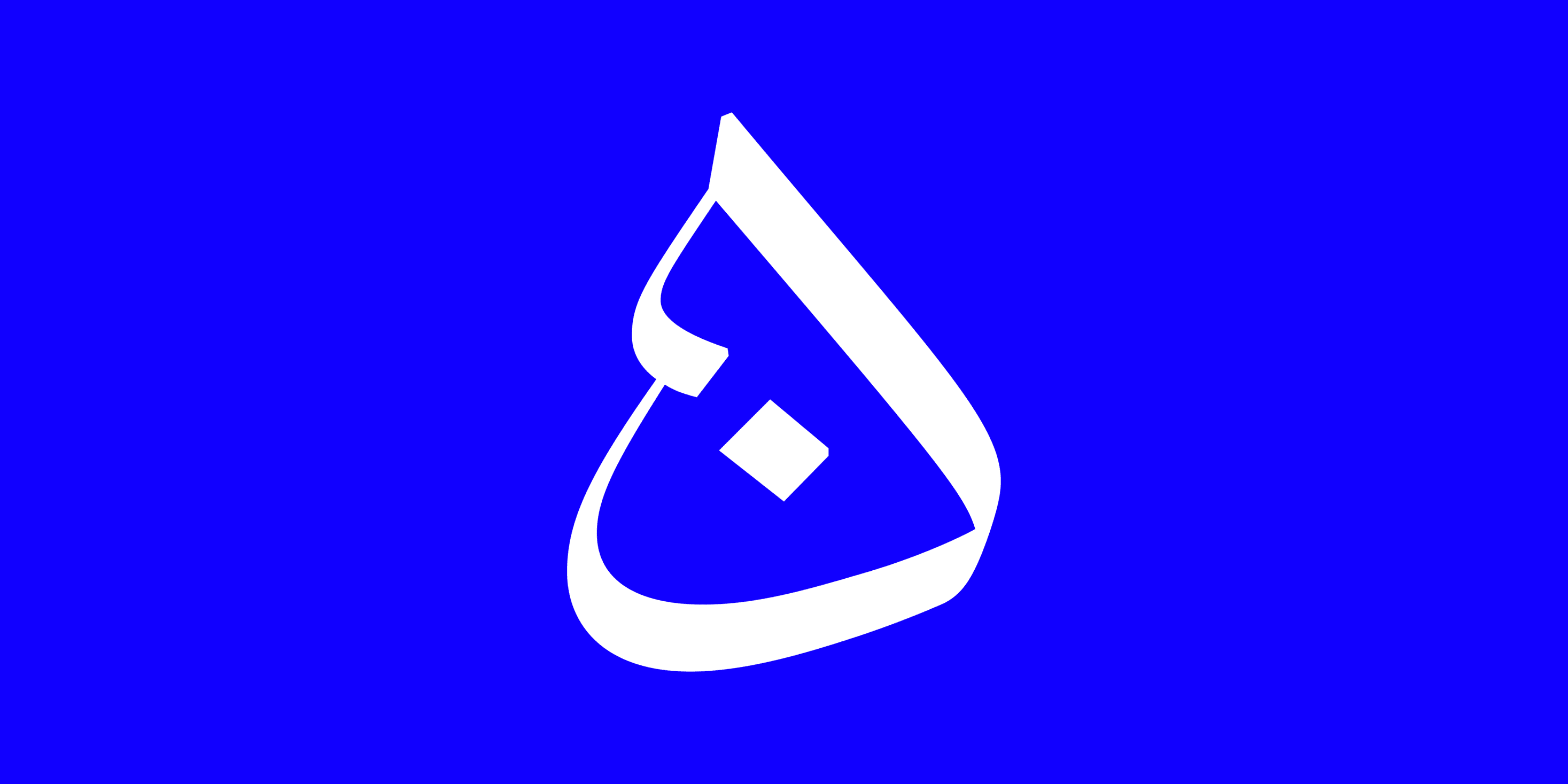
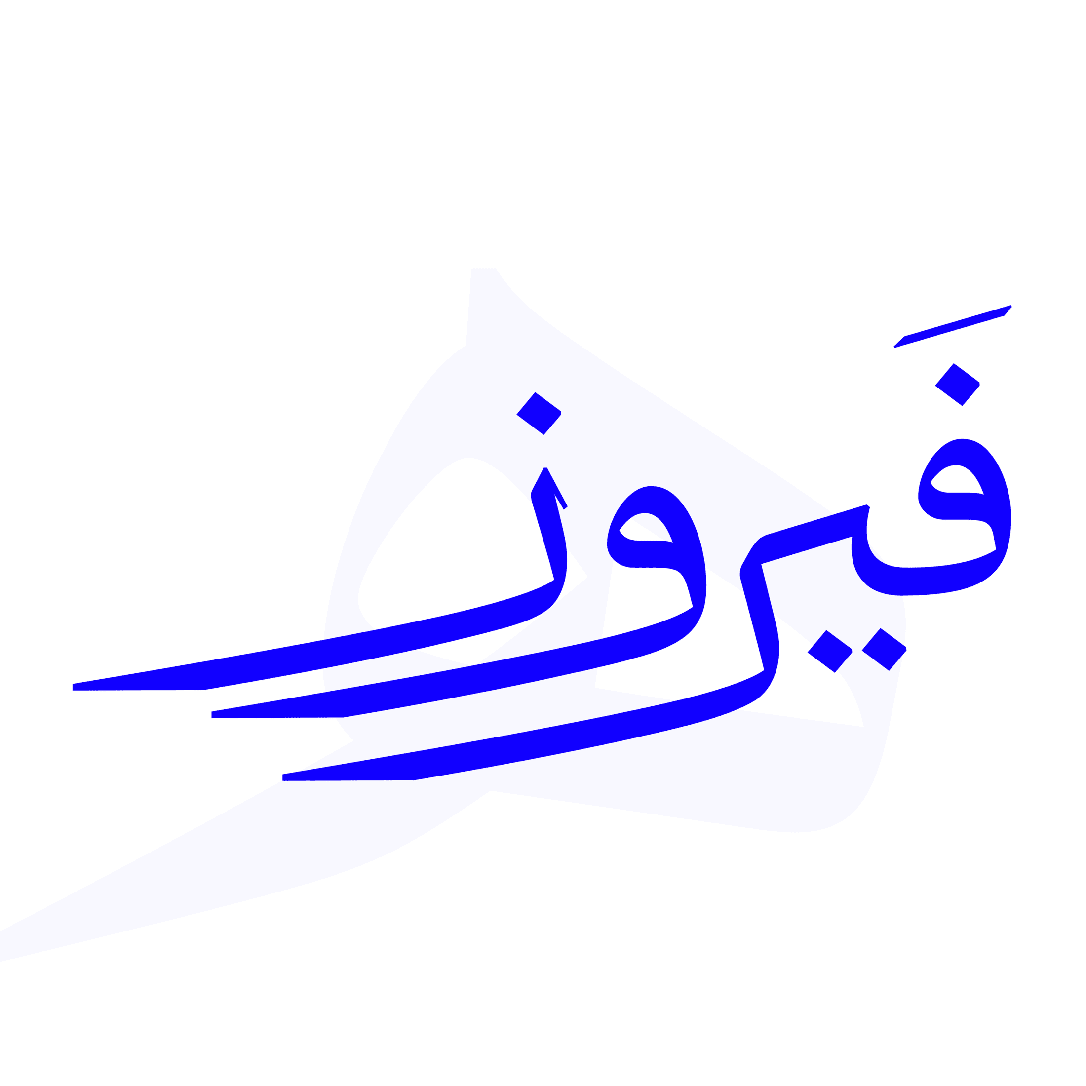
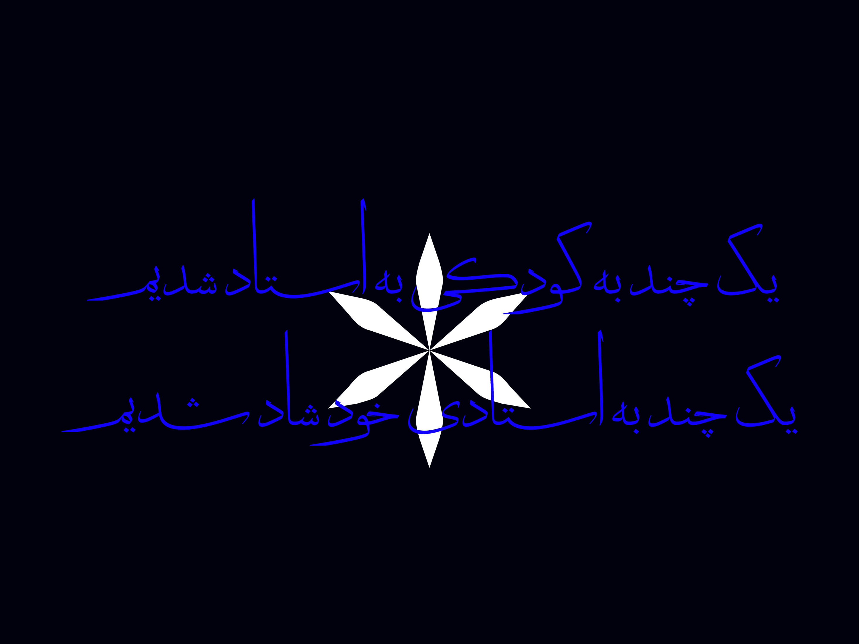
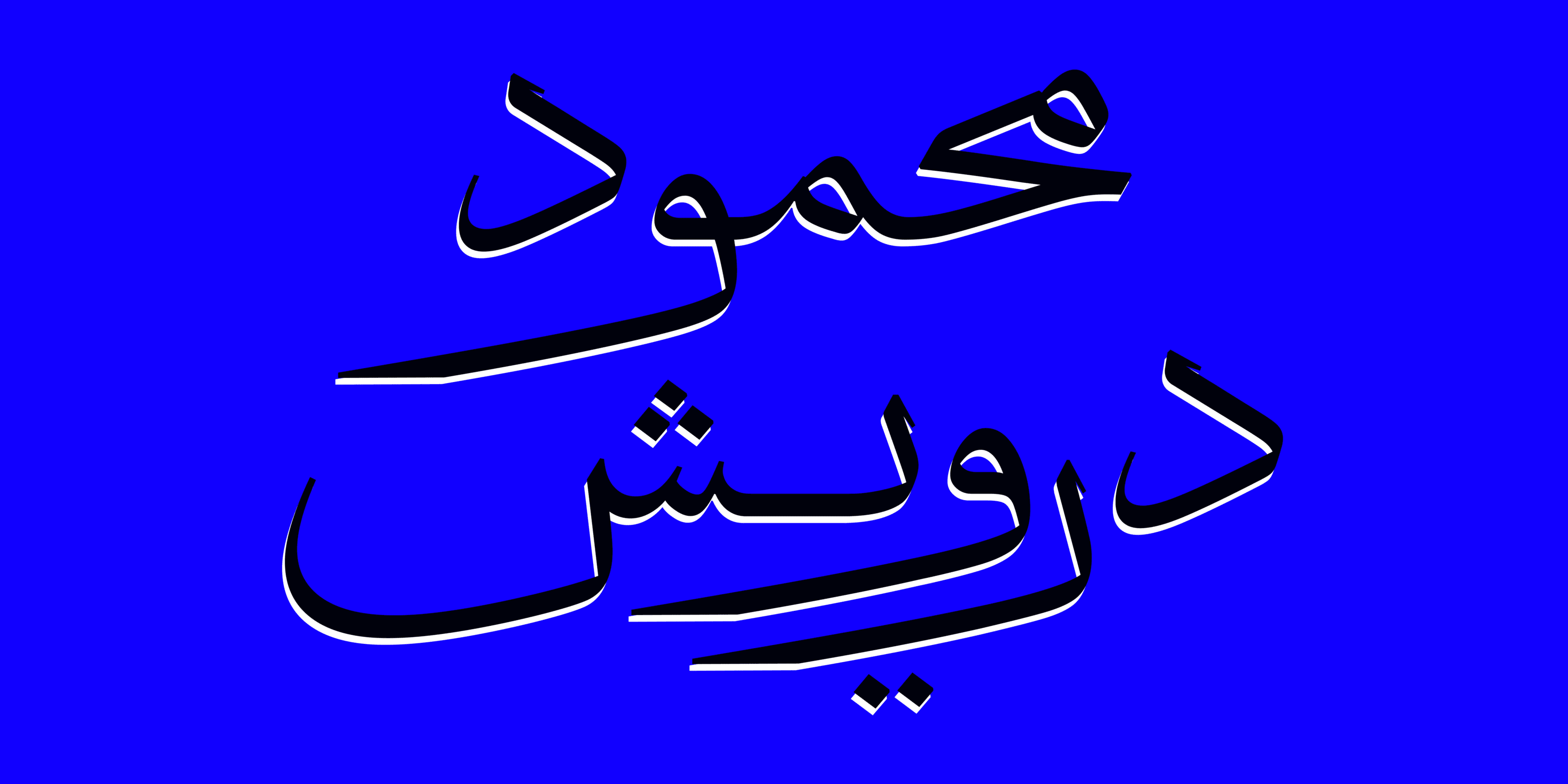
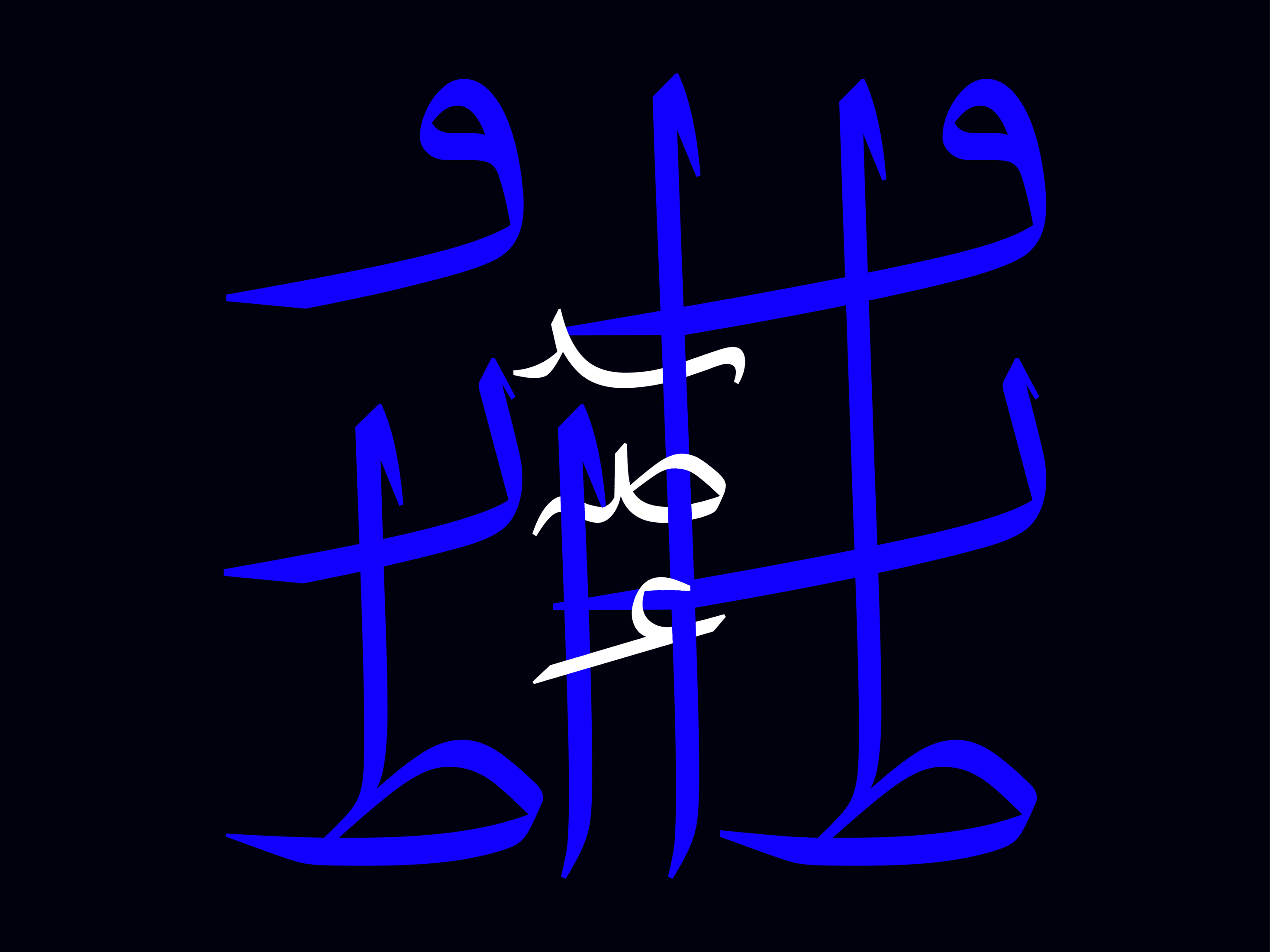
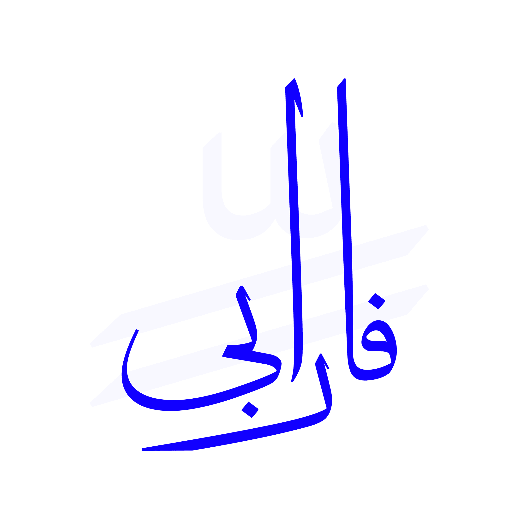
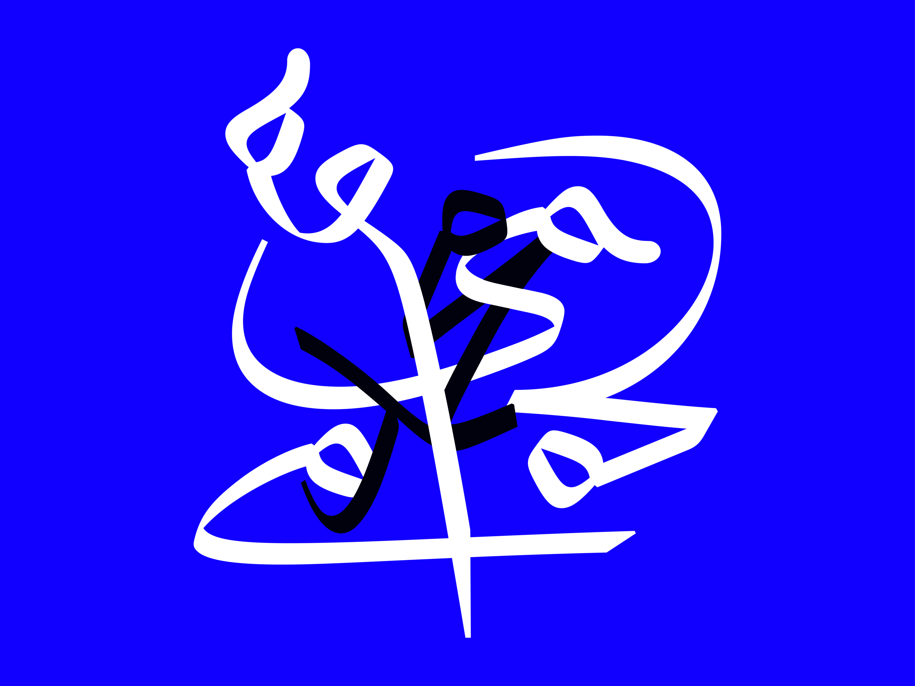
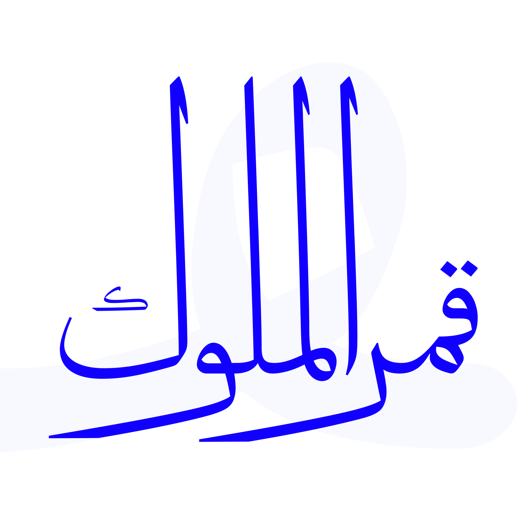
The Dong typeface possesses an epic and historical spirit, as if it has emerged from the depths of history. The tall stature of the letters enhances the heroic essence of this typeface. Dong is suitable for use in various graphic contexts.


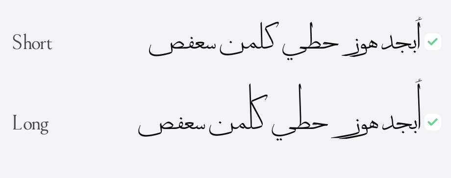
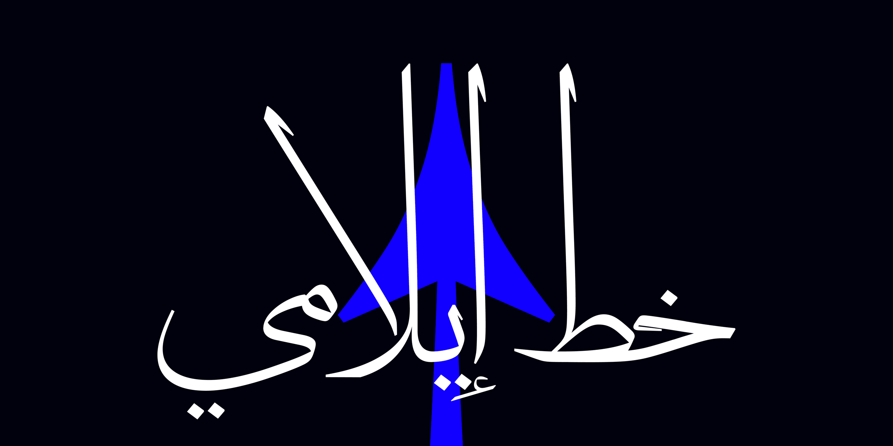
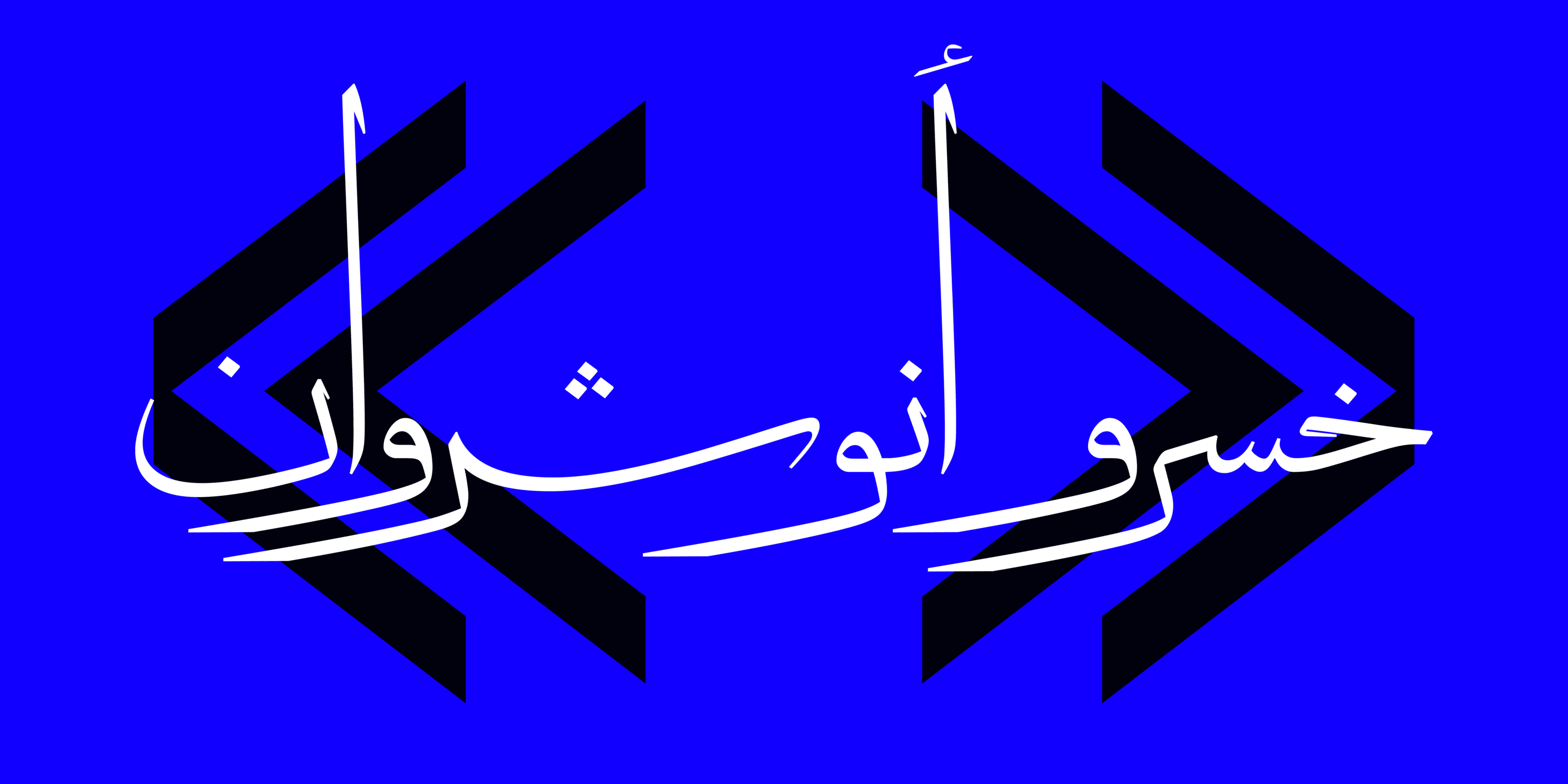
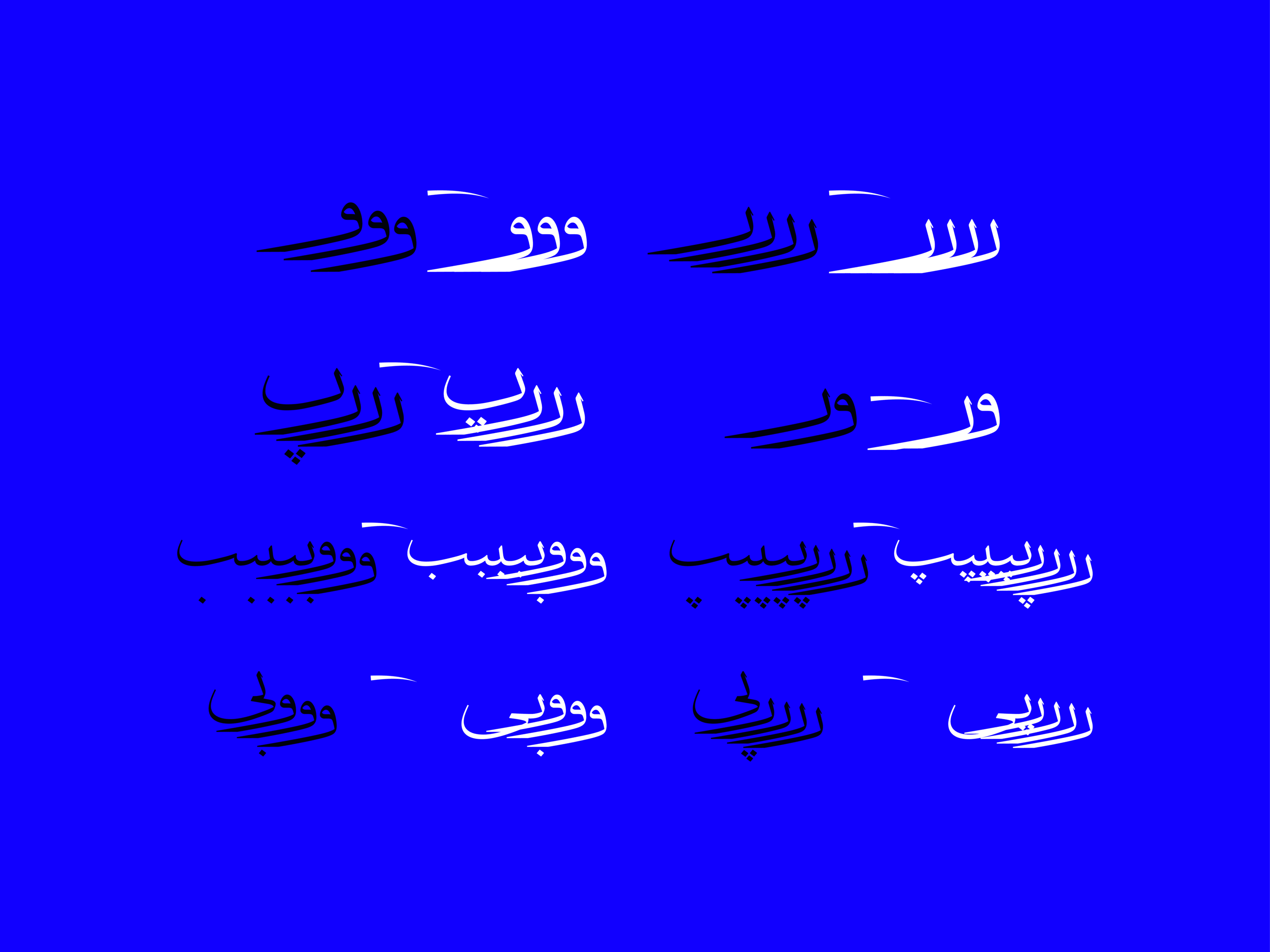
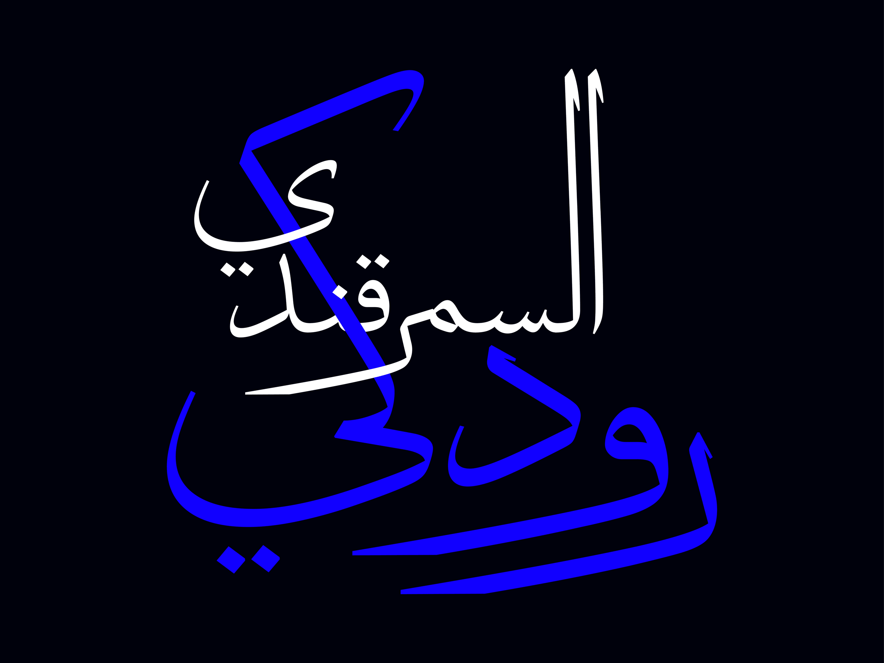
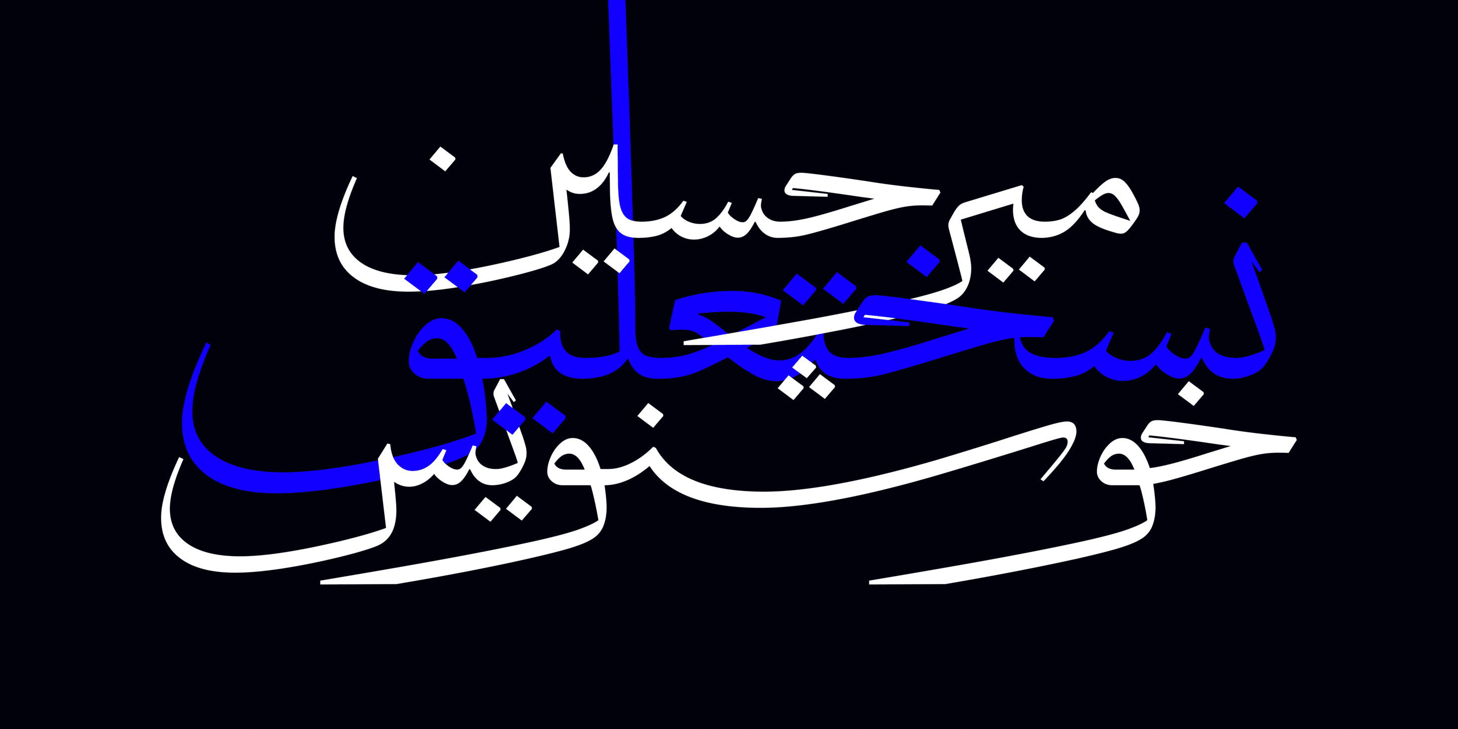
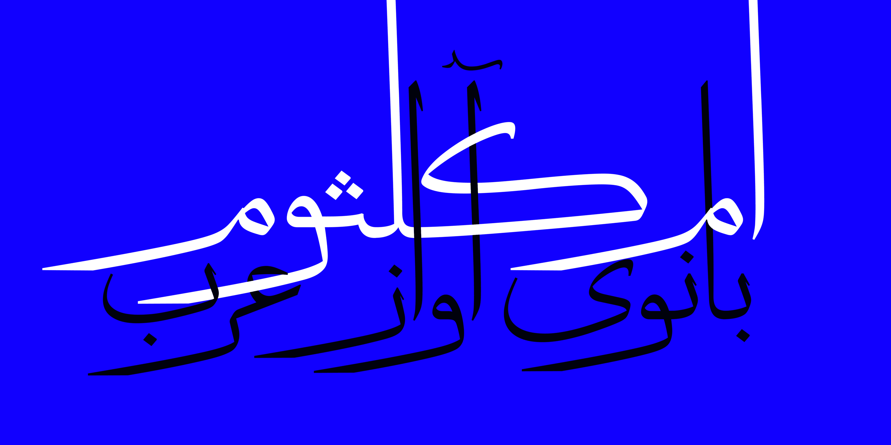
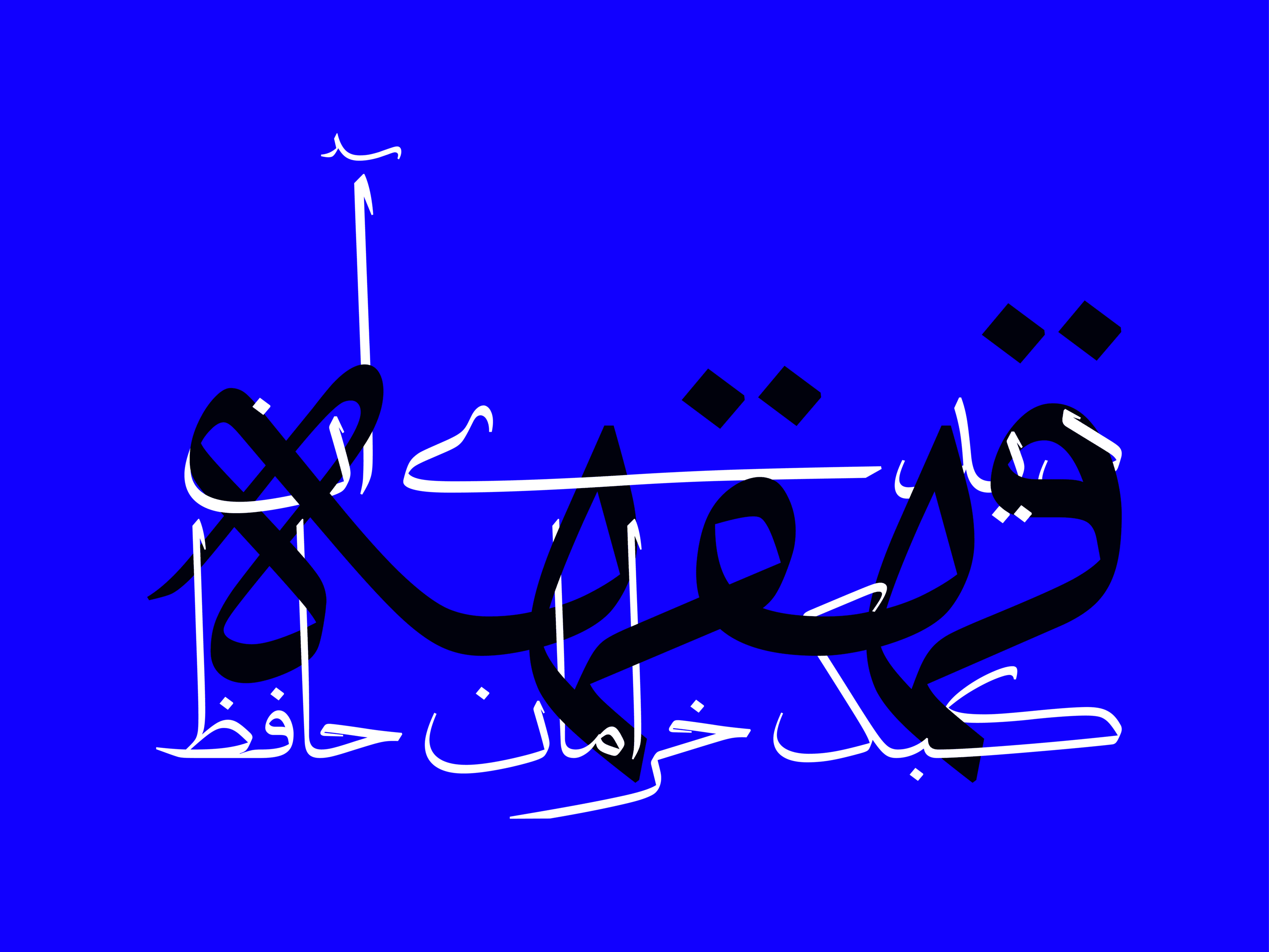
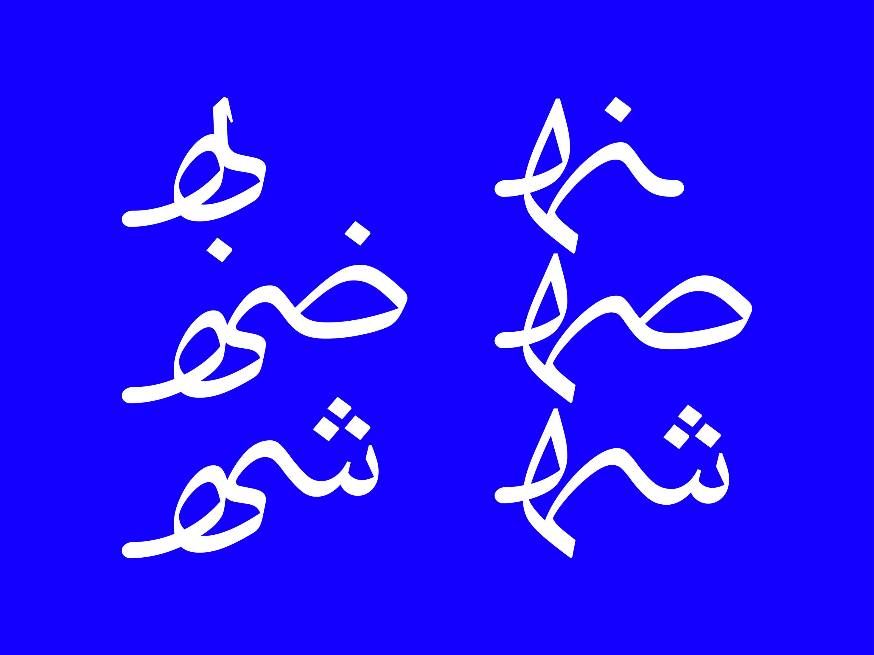
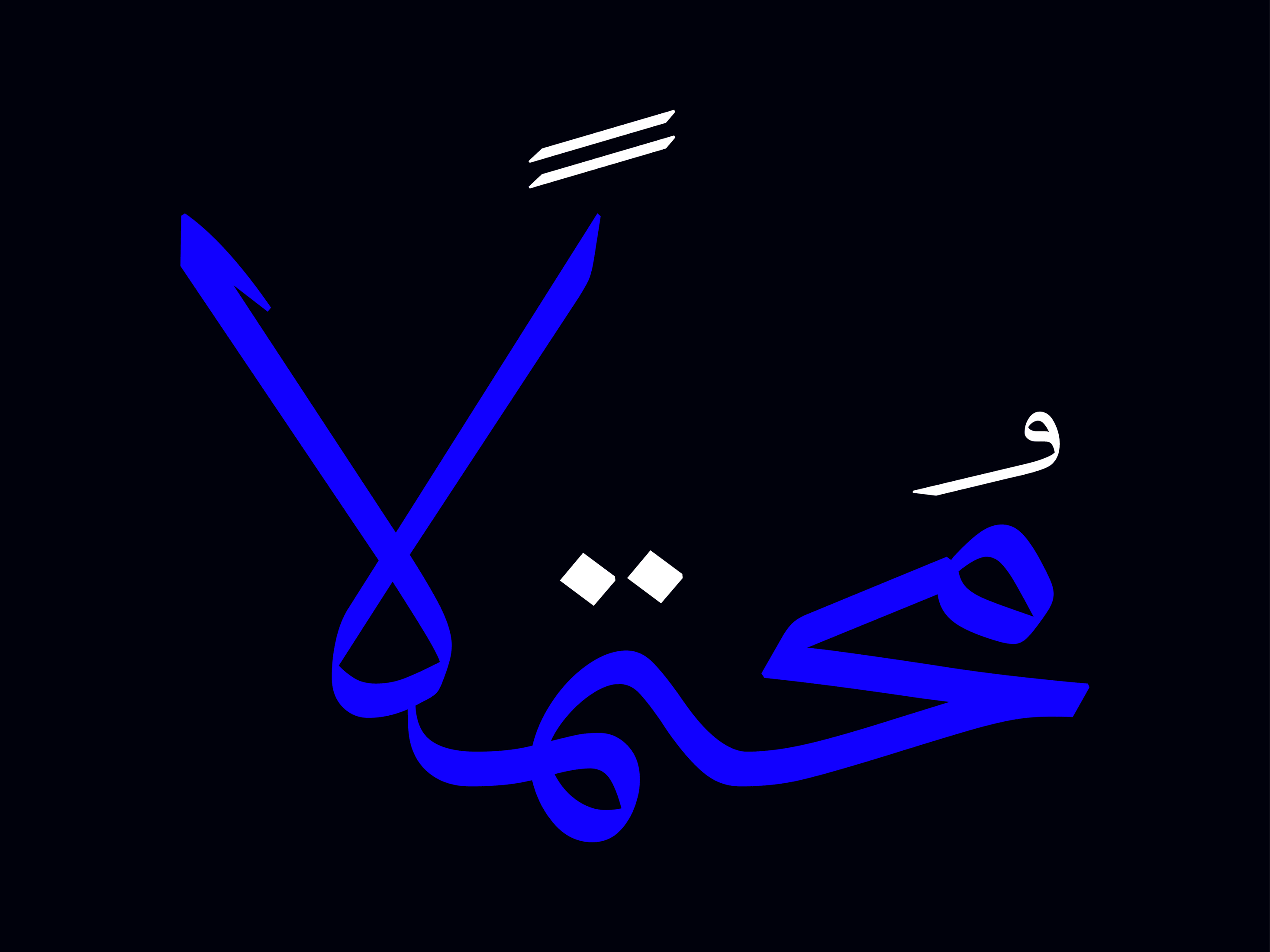
Notable visual features of this typeface include the dominance of the round surface, the presence of serifs in certain letters like Alef, Be, Je, Dal, and Ta. The ends of the letters and Re and Me are written and delivered freely. Due to the vertical elongation of some letters, words cluster around the base line, creating a balance of lightness and heaviness in the text, sometimes resulting in interesting contrasts of ink and white space. The elongated forms of the letters Re and Me often create a rhythm together or leave space for subsequent letters, allowing them to fit seamlessly within the text.


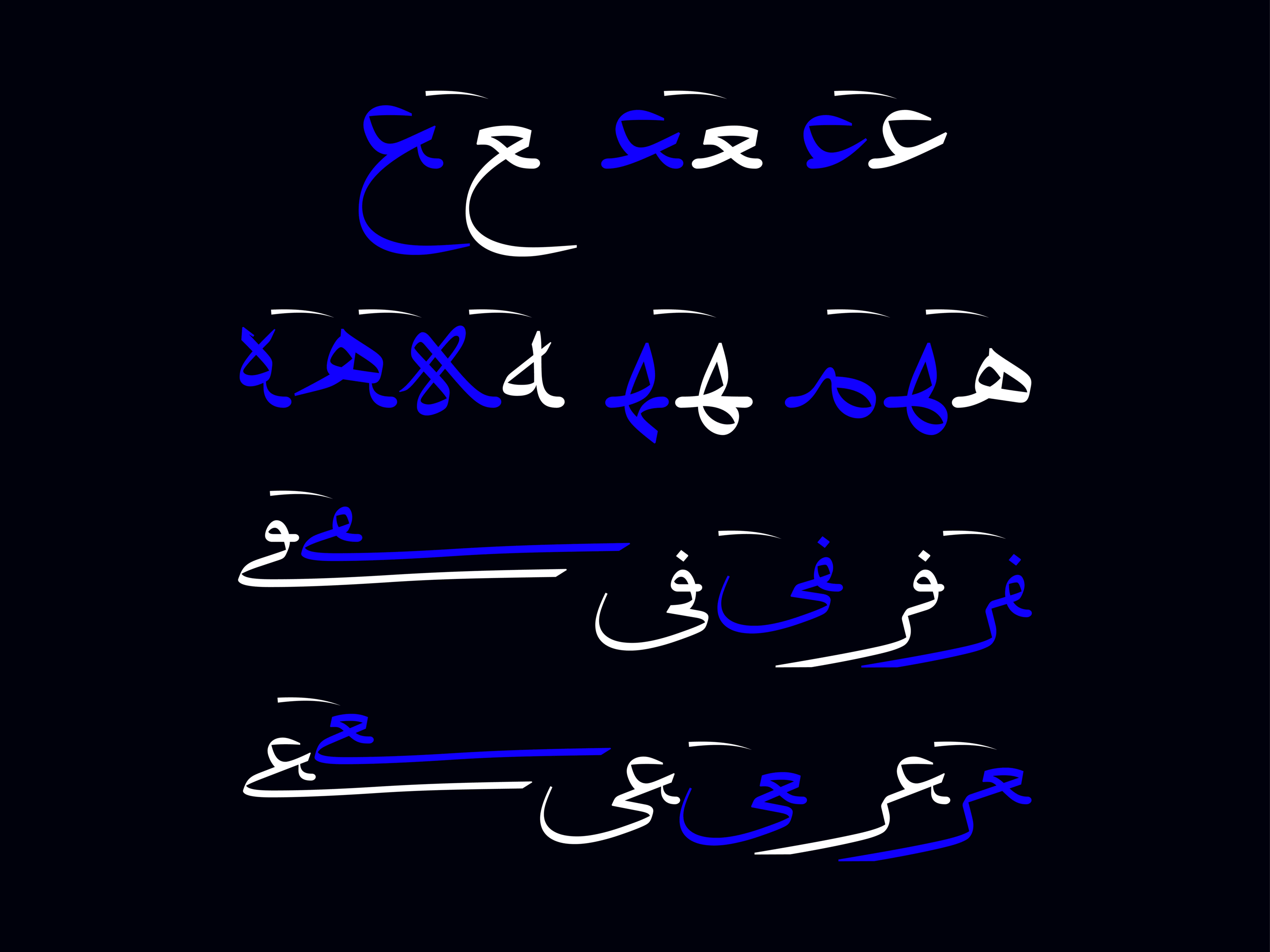
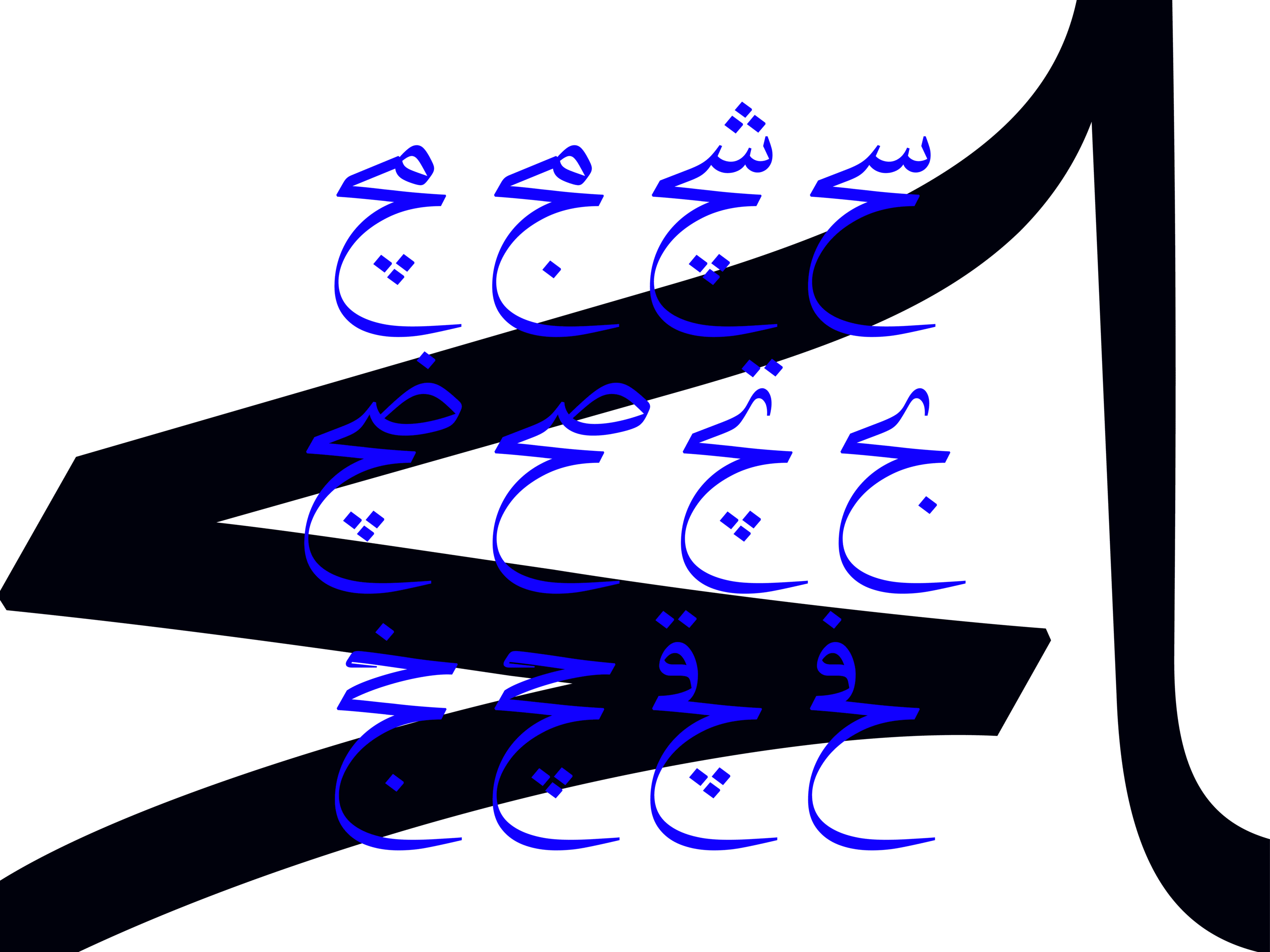
The Dong typeface features numerous ligatures and alternate letters, providing designers and typographers with the flexibility to create engaging works. These ligatures and alternate characters introduce variety, making the text more readable and appealing to the intended audience.


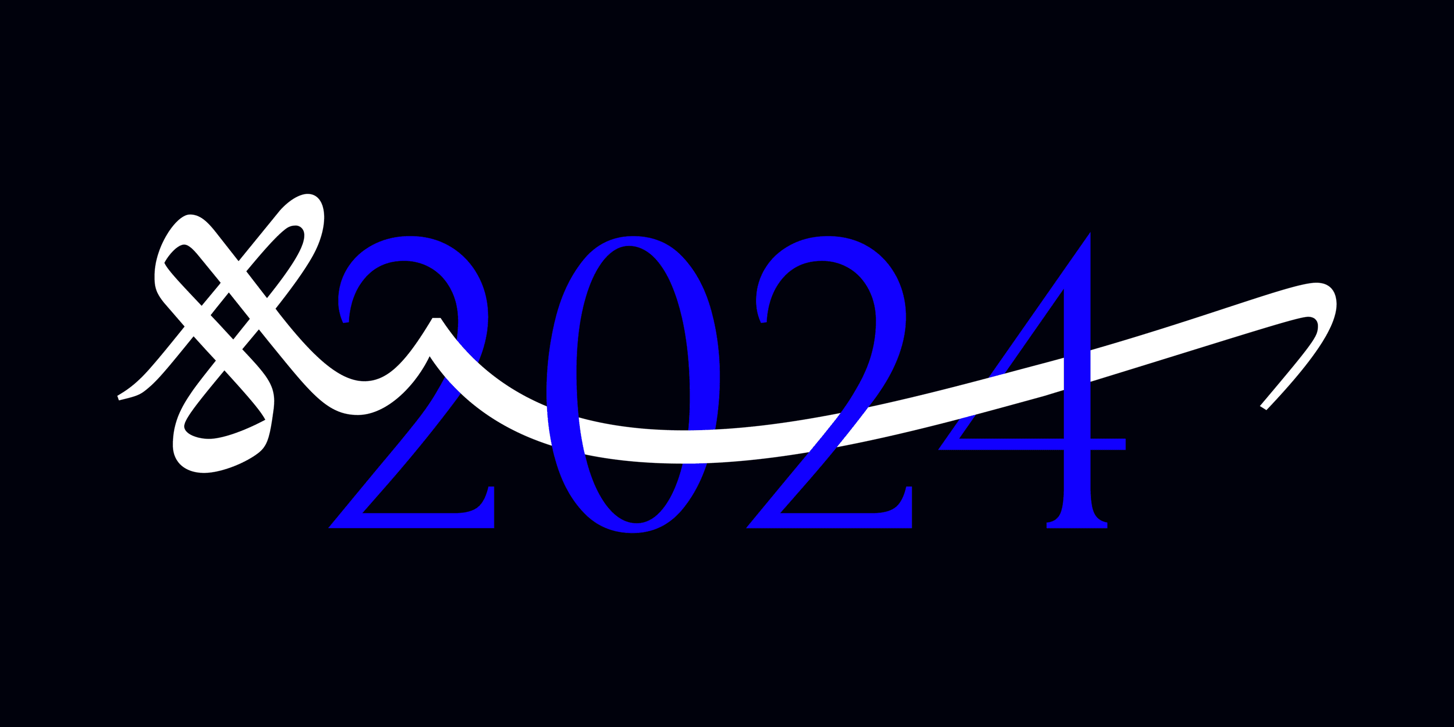
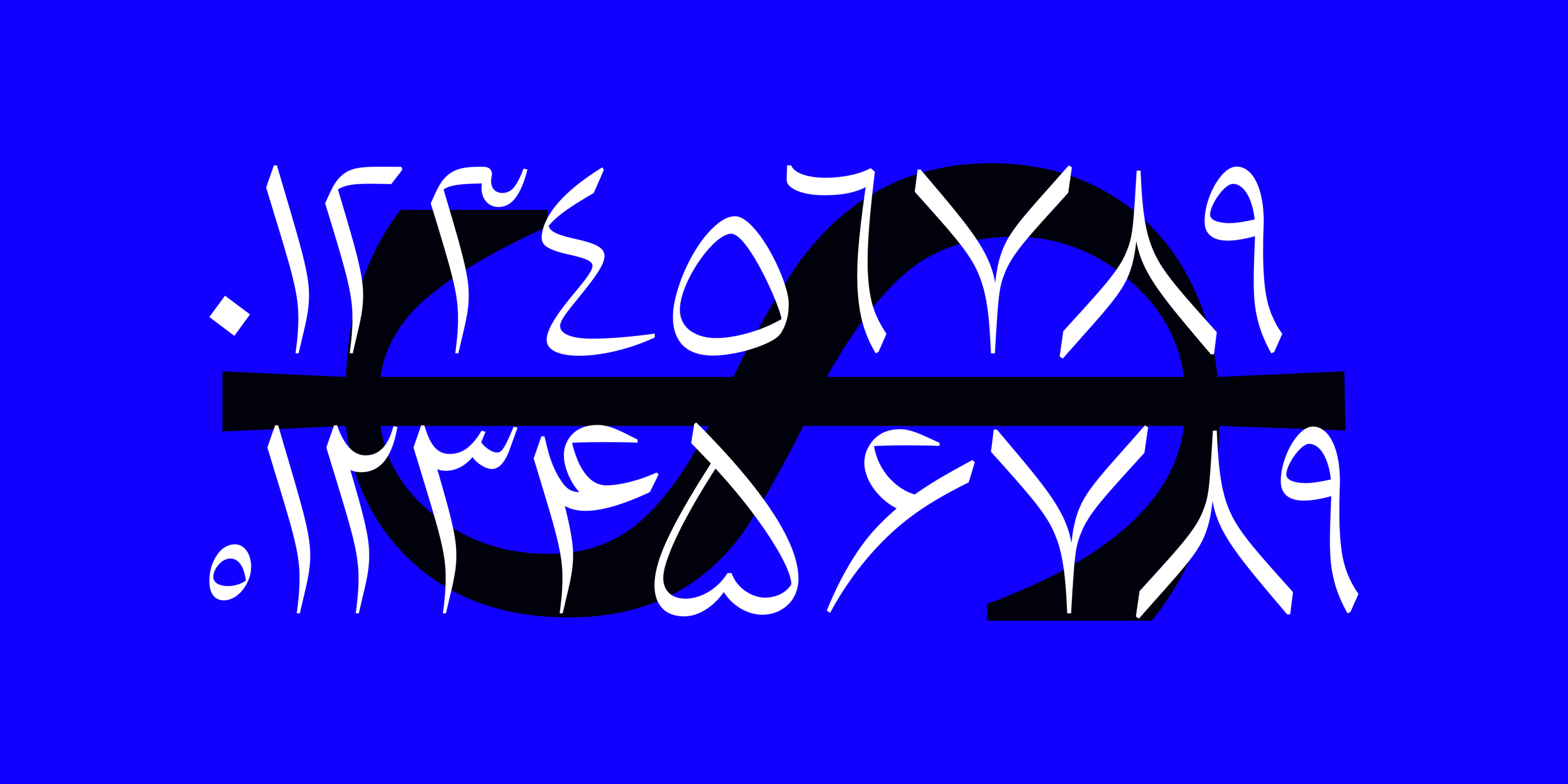
This typeface supports not only Persian but also Arabic, Urdu, Kurdish, and Latin languages. In the Latin typeface, efforts have been made to ensure that the letters display a consistent grayness when placed alongside Persian or Arabic characters, maintaining harmony in design and equal contrast. The Latin typeface also features ligatures, making it suitable for both text and titles.


Please note that in the Dong typeface, the elongated forms of certain letters may cause overlaps in some words. We recommend thoroughly reviewing the user manual before using this font to address any potential overlaps and ensure a smooth experience.
- Original Fonts: Available in ttf and otf formats in 2 styles.
- user manual
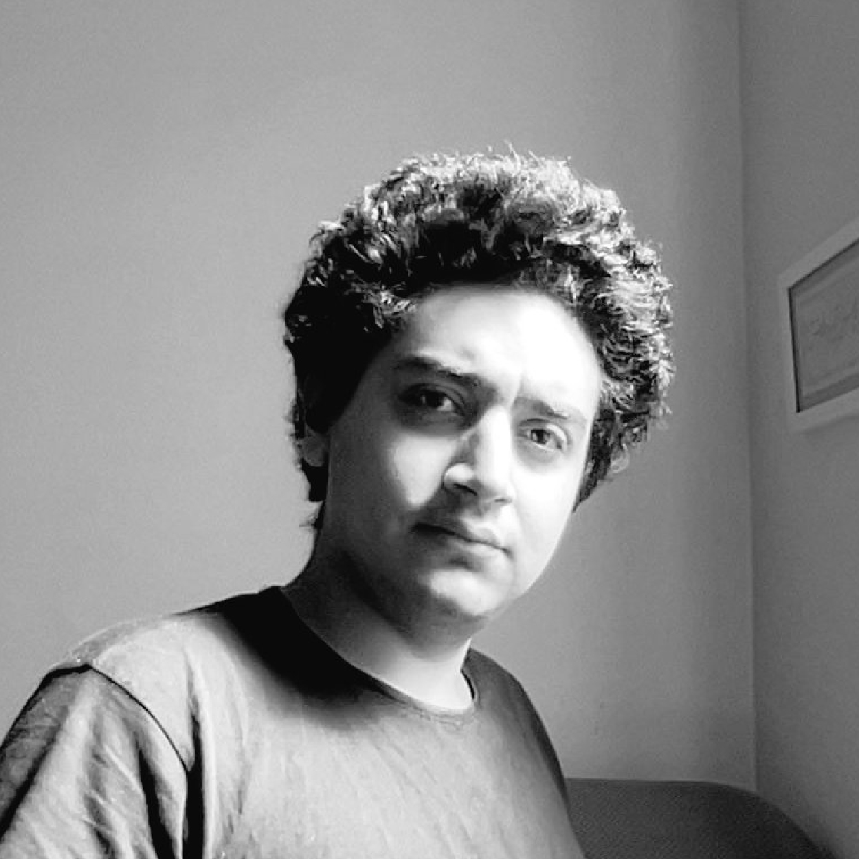
Born in 2004 in Tehran. Graduated from the Academy of Fine Arts. Student of the University of Arts. Type designer and font developer.







Comments
Frequently Asked Questions