


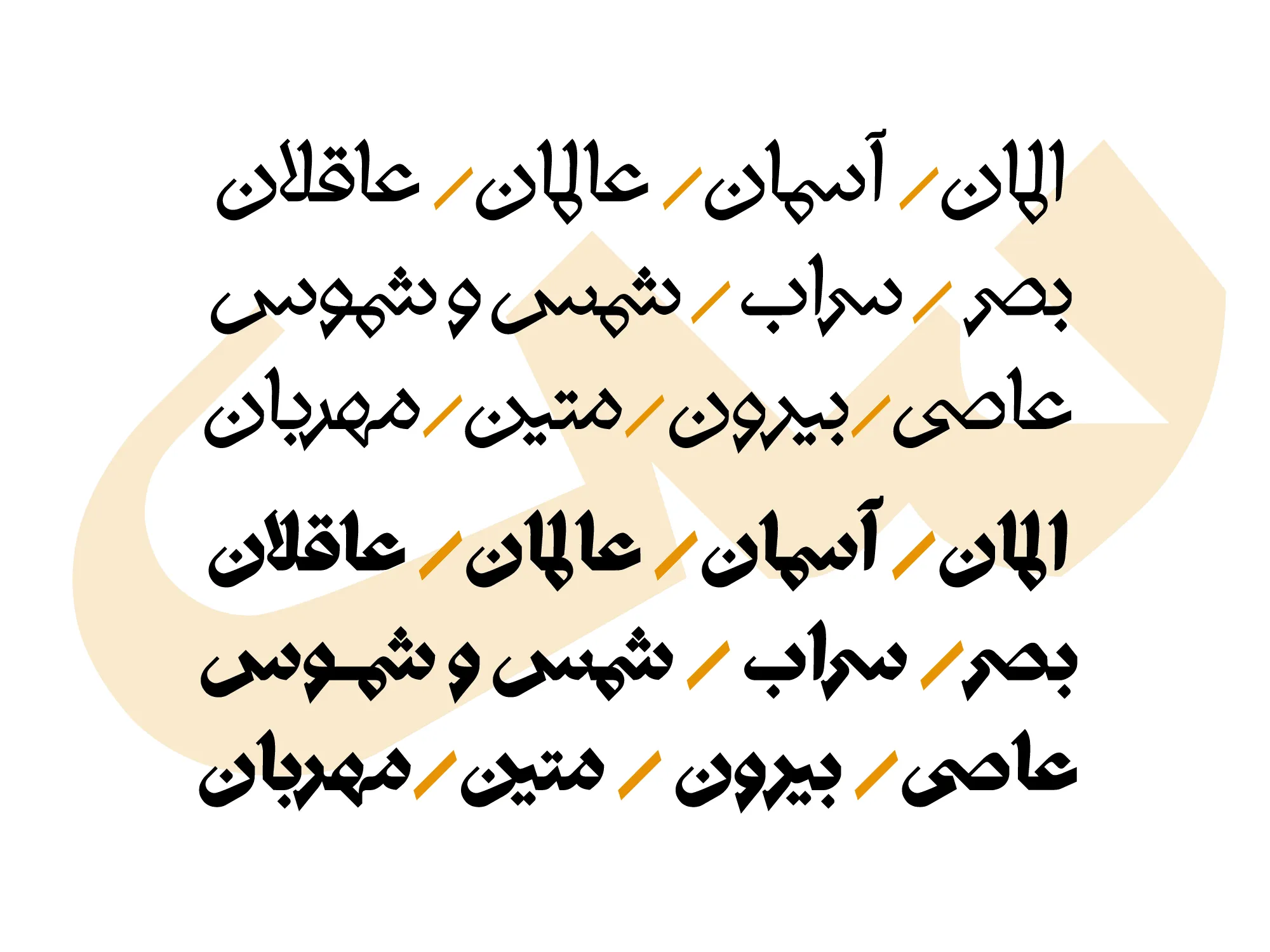
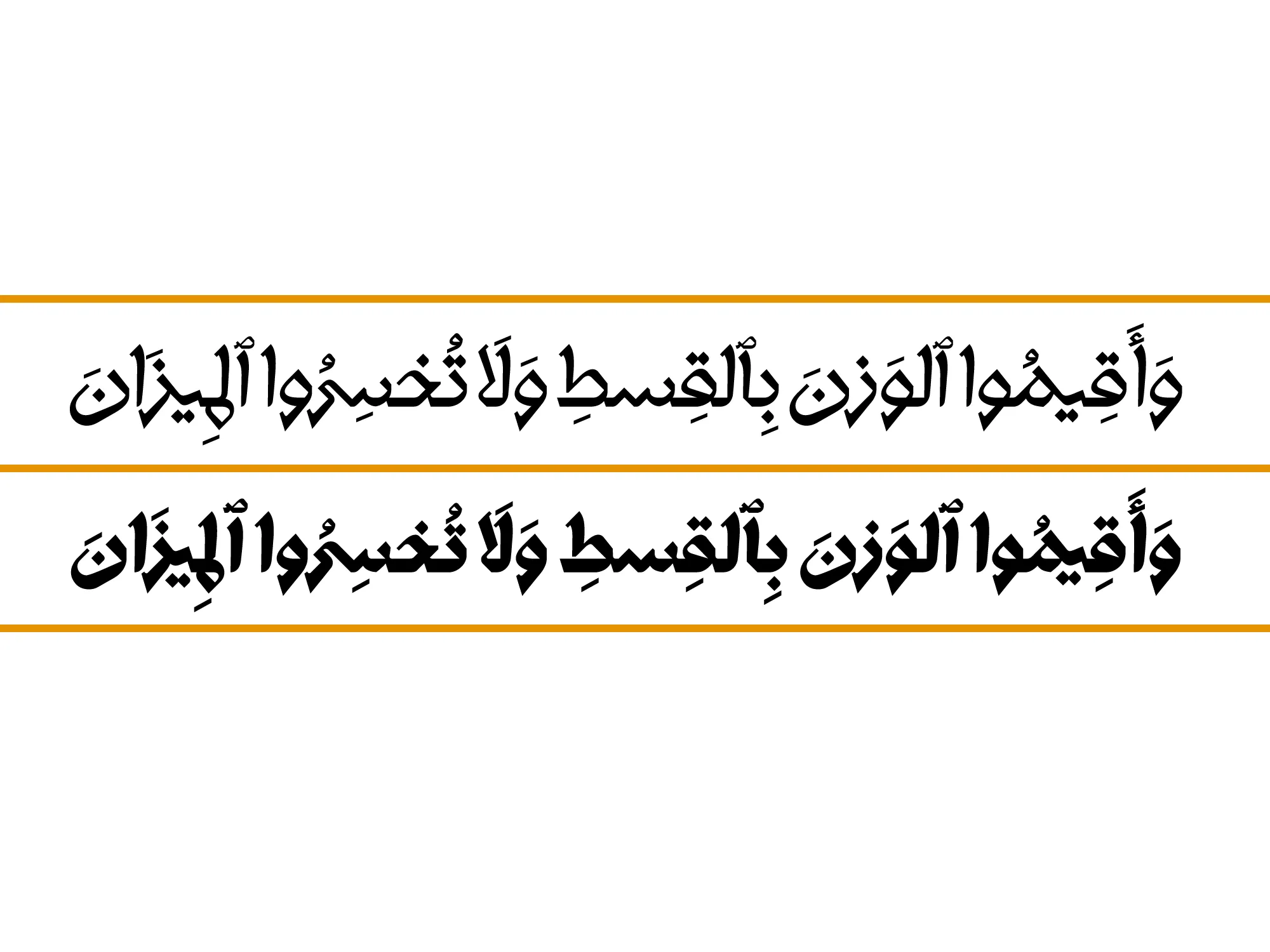
Sanjaq

Specifications
What you get
In the SANJAQ font package, you will receive the following items:
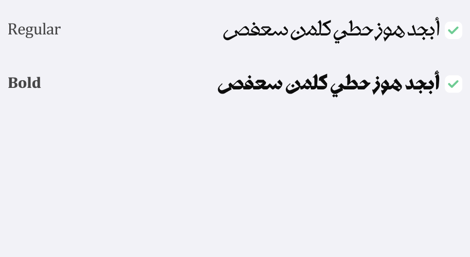
Original Fonts: Available in ttf in 2 weights(Regular, Bold).
Web Fonts: Special fonts for use on websites in woff and woff2 formats.
Release Date:
July 23, 2023
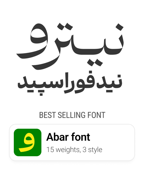
Weight | style :
2 Weight
Designed By

Rasool Kamali
Type Designer
Born in 1982, Rasoul Kamali is a graphic designer, instructor, and art researcher. He holds a Master's degree in Visual Communication and a PhD in Philosophy of Art. He is also a faculty member at the University of Art in Isfahan.
Related fonts

Doran
99
€


Comments
Frequently Asked Questions