Kook
The Creation of Kook typeface
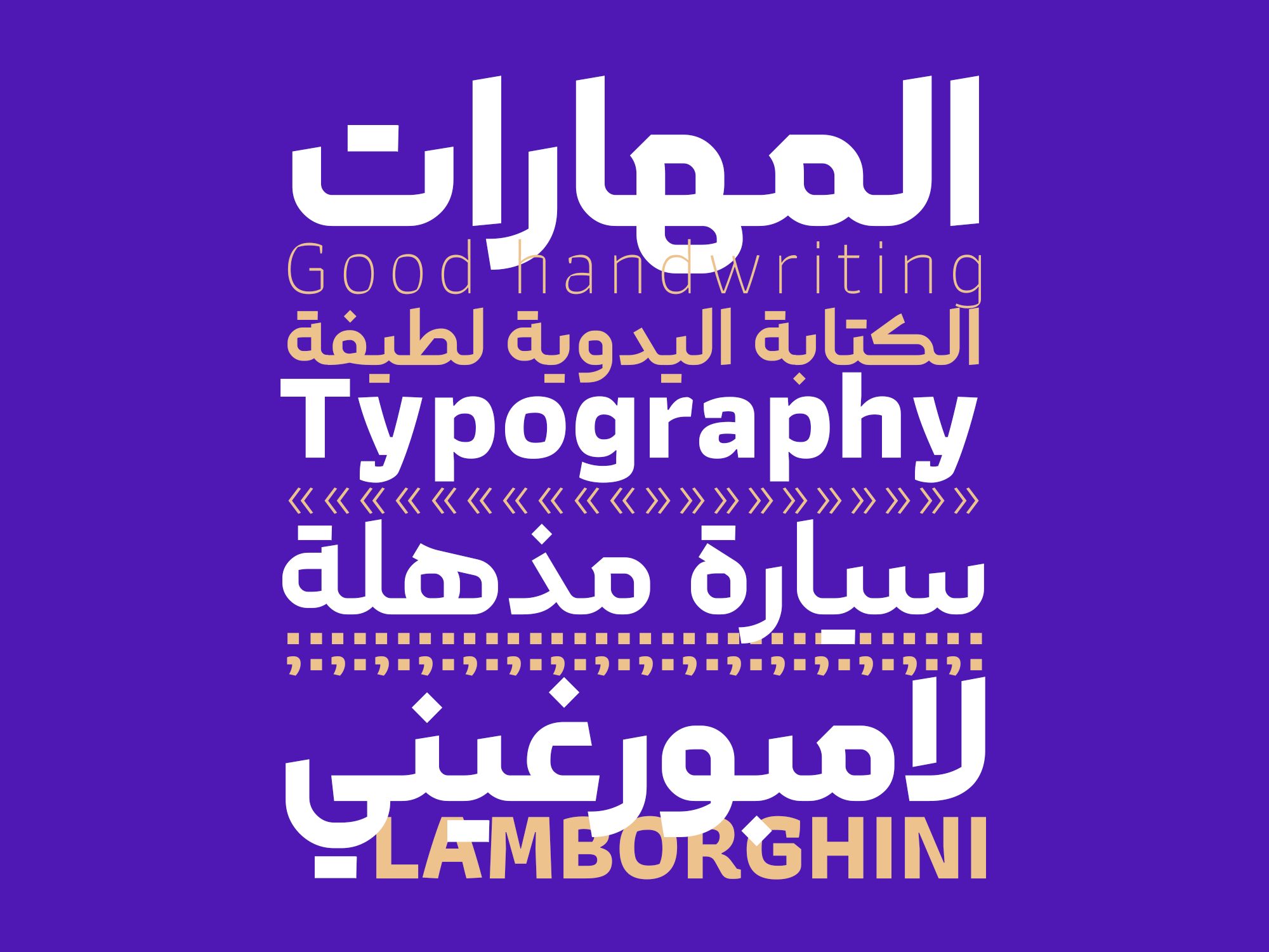
The idea behind designing the Kook typeface originated during the creation of an advertising poster. The aim was to develop a font that seamlessly blended geometric lines with calligraphy while maintaining harmony with Latin fonts


The Design and Tuning Process of Kook typeface:
Kook typefaceinitially started as a simple geometric typeface. However, in later stages, the designer added a twist to the pen strokes and refined the typefacemultiple times to reach their current form. The goal was to create a font with well-balanced components and a pleasing appearance.


A Variety of Weights and Languages in the Kook typeface:
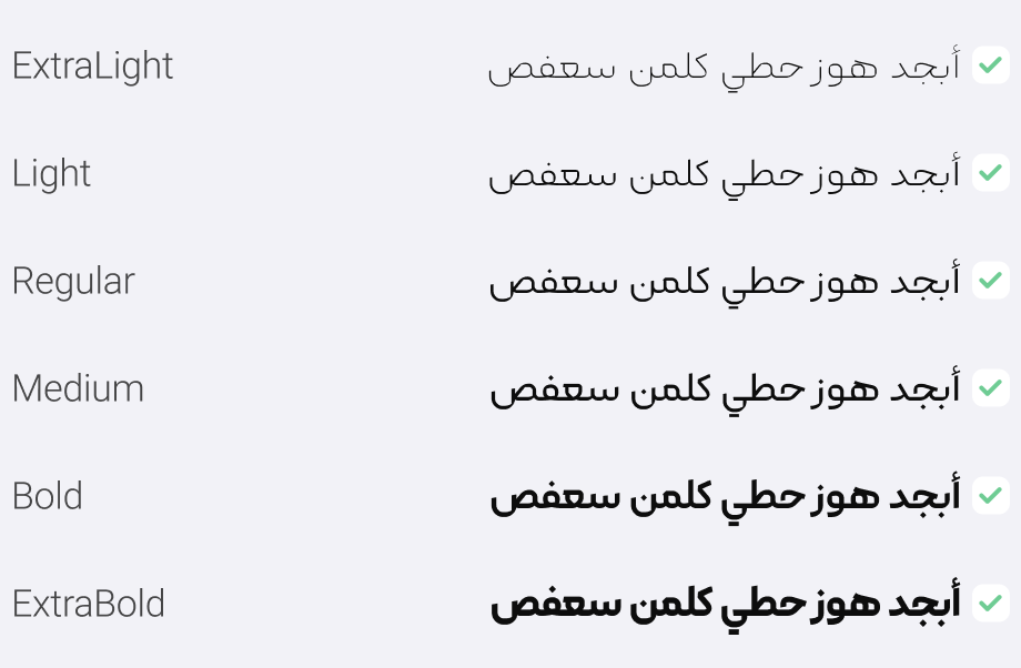
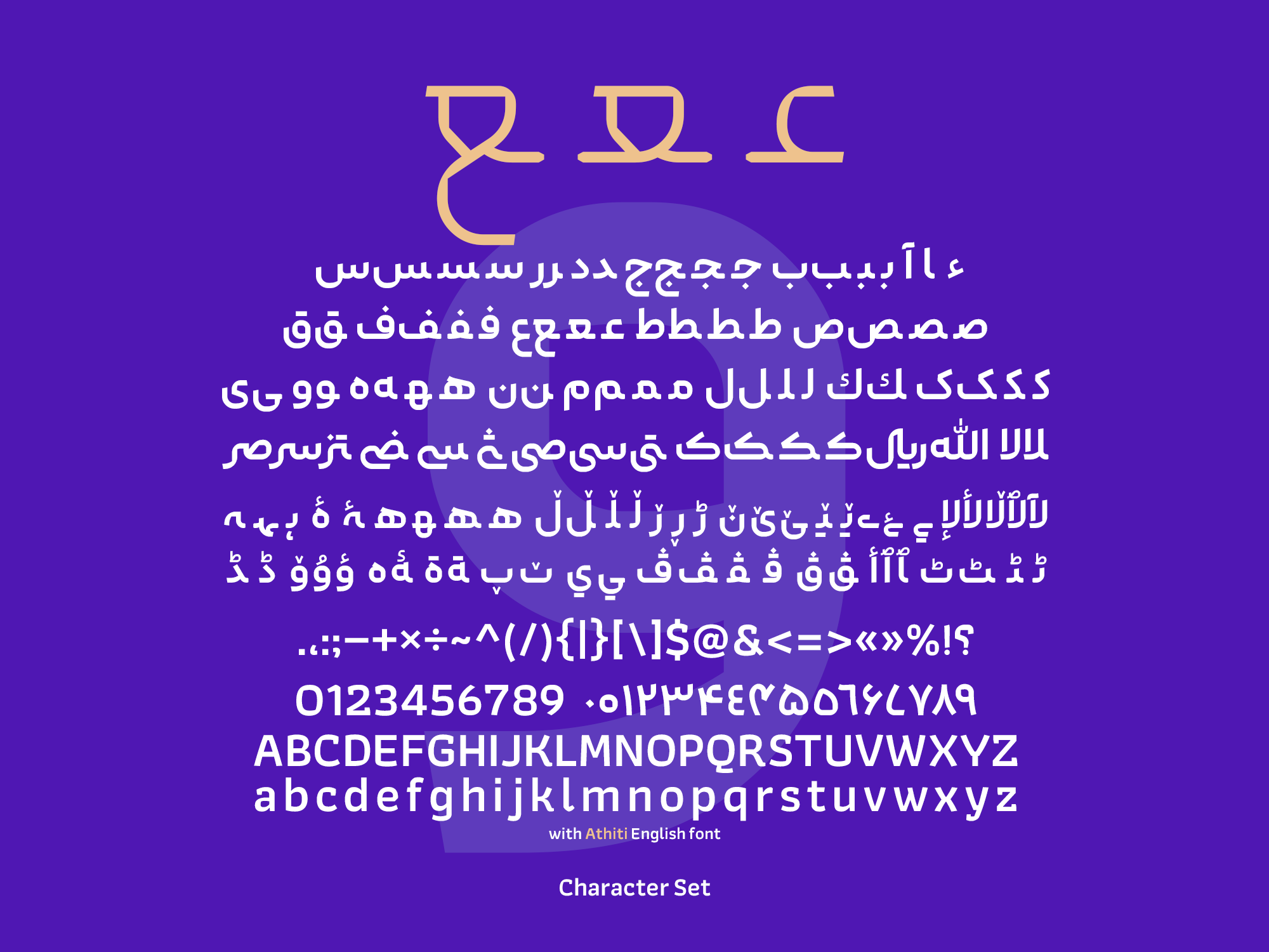
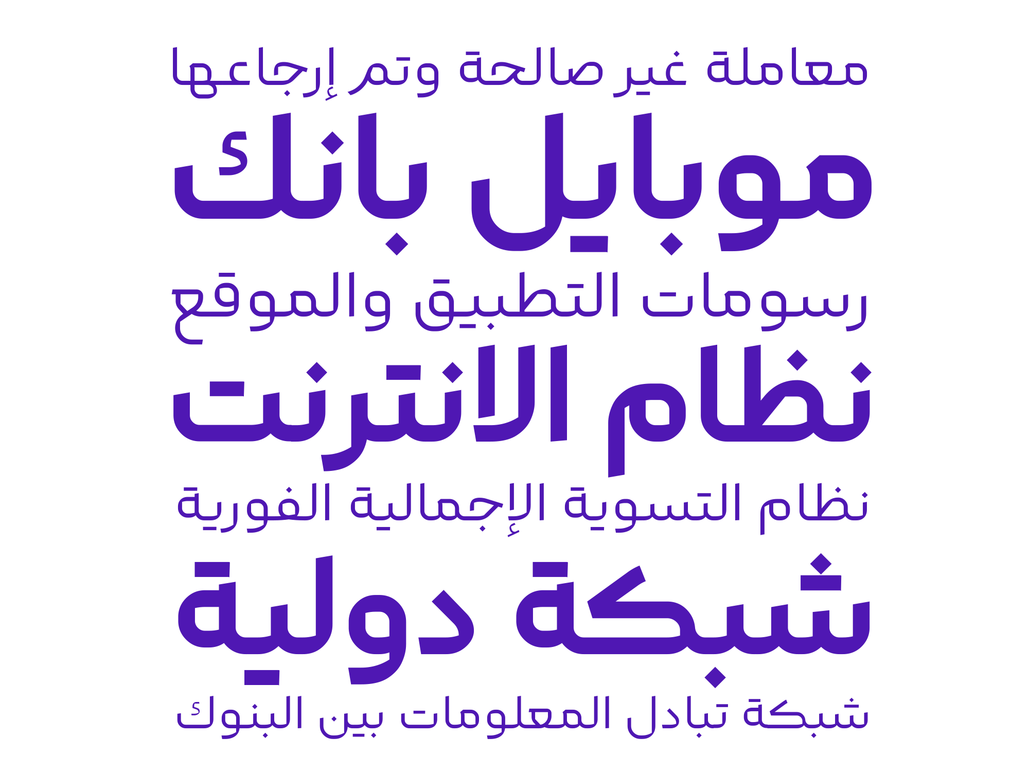
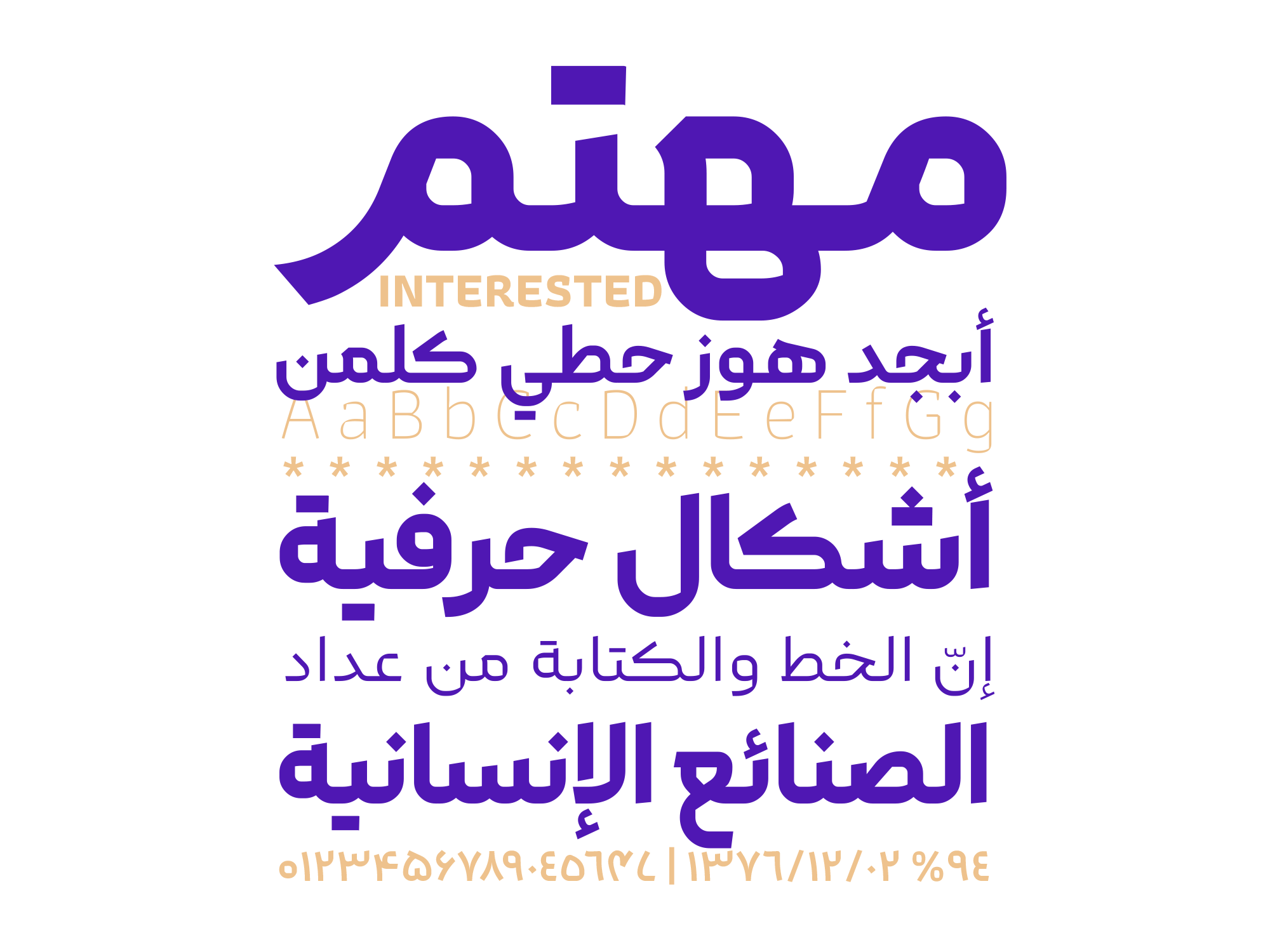
Kook is a 6-weight font family (ExtraLight, Light, Regular, Medium, Bold, ExtraBold) that supports Persian, Arabic, Kurdish, Urdu, and English. The English version of the font is based on the open-source font Athiti.

In the Kook font package, you will receive the following:
- Main Fonts: 6 weights in TTF format.
- Web Fonts: Special fonts for use on websites in WOFF and WOFF2 formats.
- Fonts with Persian Numbers: Fonts in which English and Arabic numerals are displayed in Persian format.
- Fonts without English Characters: Fonts that do not contain English letters or numbers. (Suitable for combining with a preferred English font in web design).
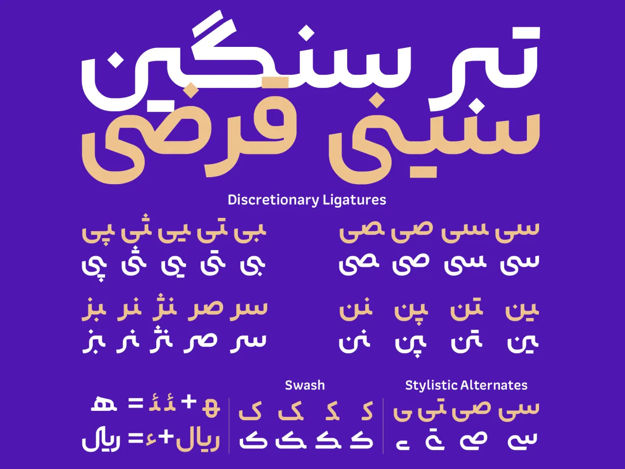
- Guide: Instructions on using Stylistic Alternates, Discretionary Ligatures, and converting Latin numbers.
Saeed Haghighat has been working as a typographer and a cover art designer since 2015. His skills lie in executing projects related to type design, typography, and cover design.











Comments
Frequently Asked Questions