


Paradox
The idea of creating the Paradox font began in 1393 (2014) due to my personal interest in the works of Morris Escher. I started designing it through trial and error, and along the way, I discovered some Latin fonts that had done the same thing. However, Persian characters were much more complex than Latin ones, and the patterns of Latin script were not applicable, so I had to spend a lot of time solving these challenges. In 1398 (2019), I focused more seriously on designing the font, and by the end of that year, its design and software implementation were almost complete. In 1401 (2022), with the precise and effective guidance of my good friend Amin Abedi (for coding), the Paradox font was finally ready for release.

Paradox

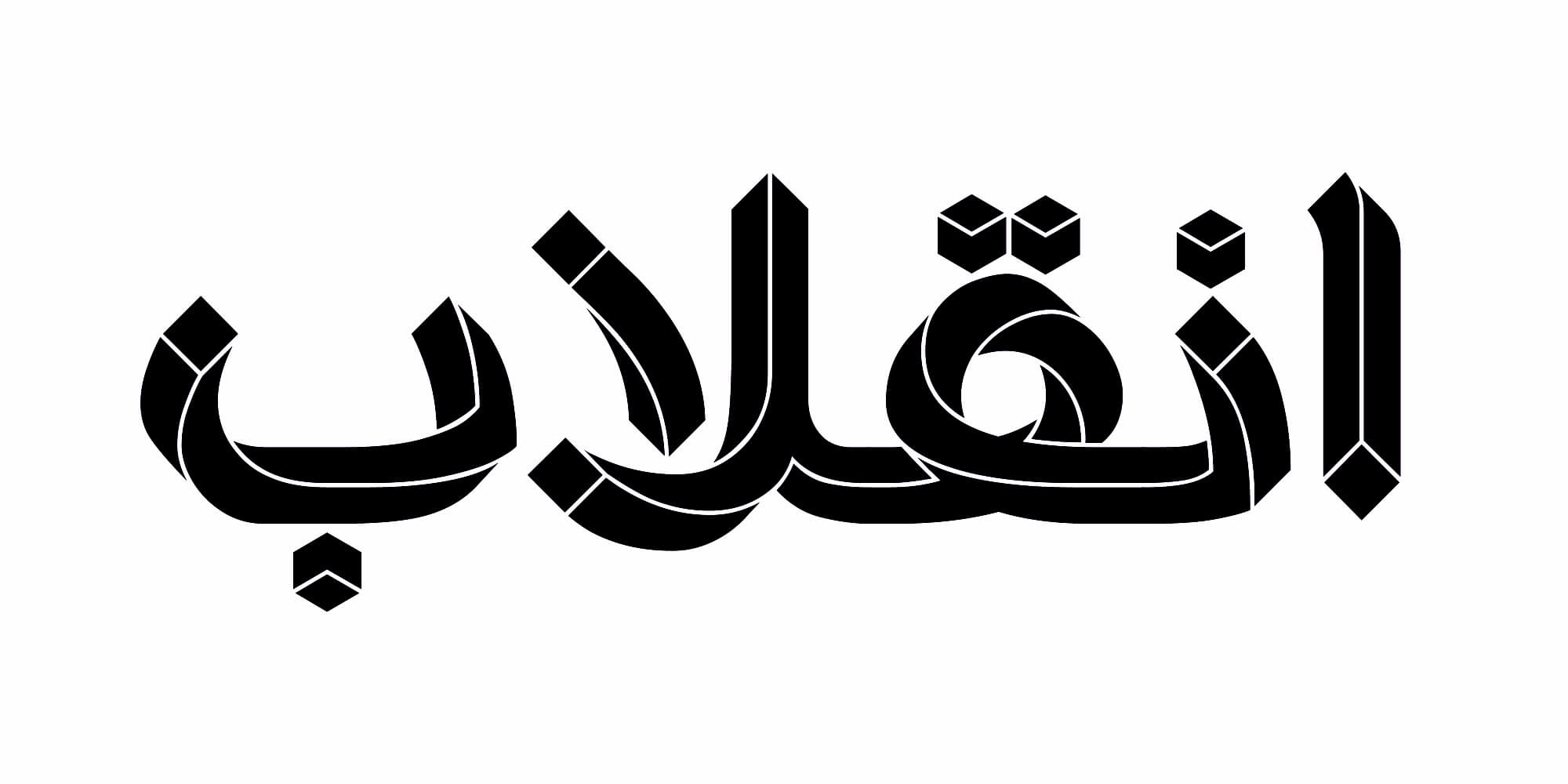
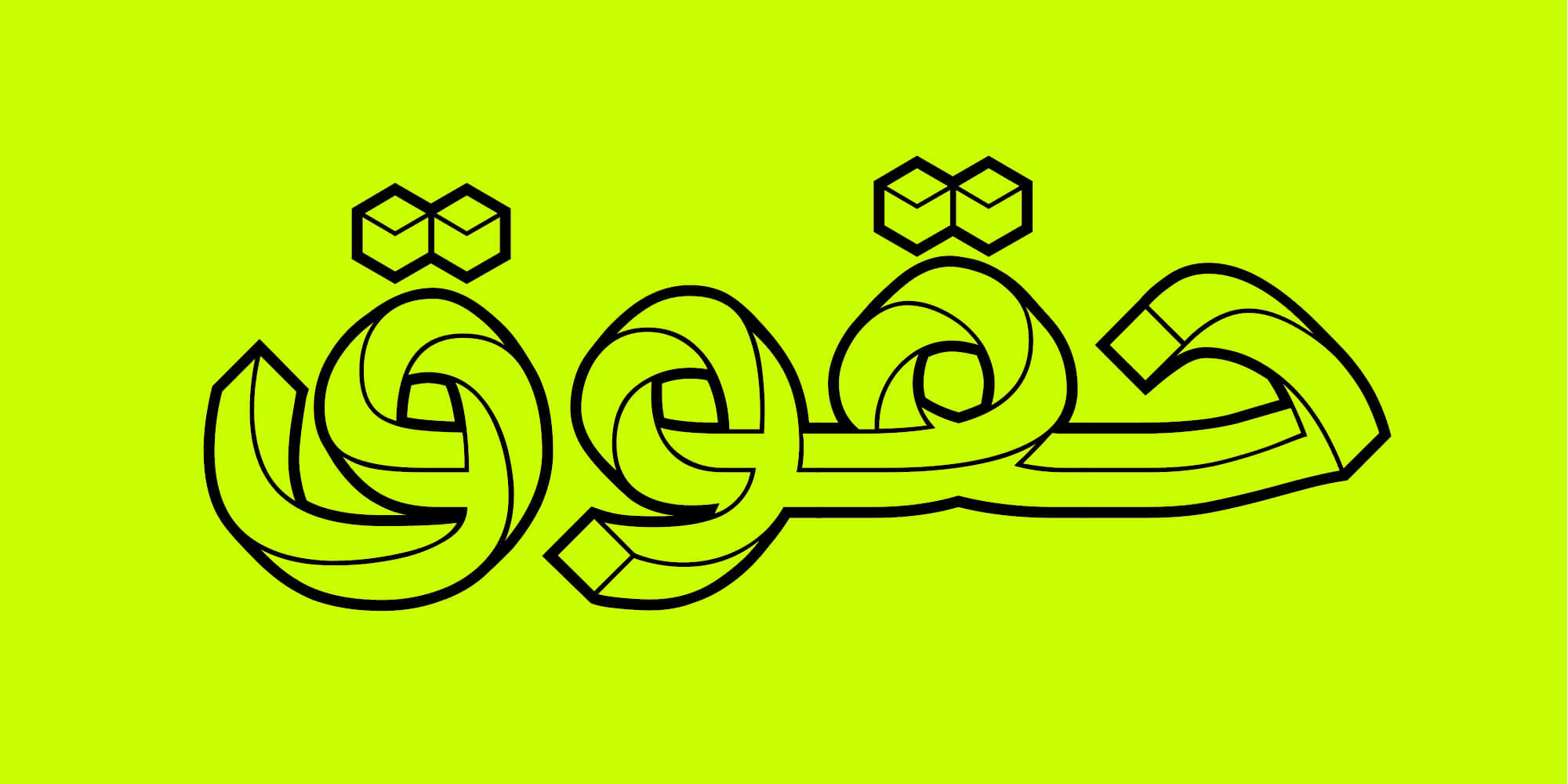
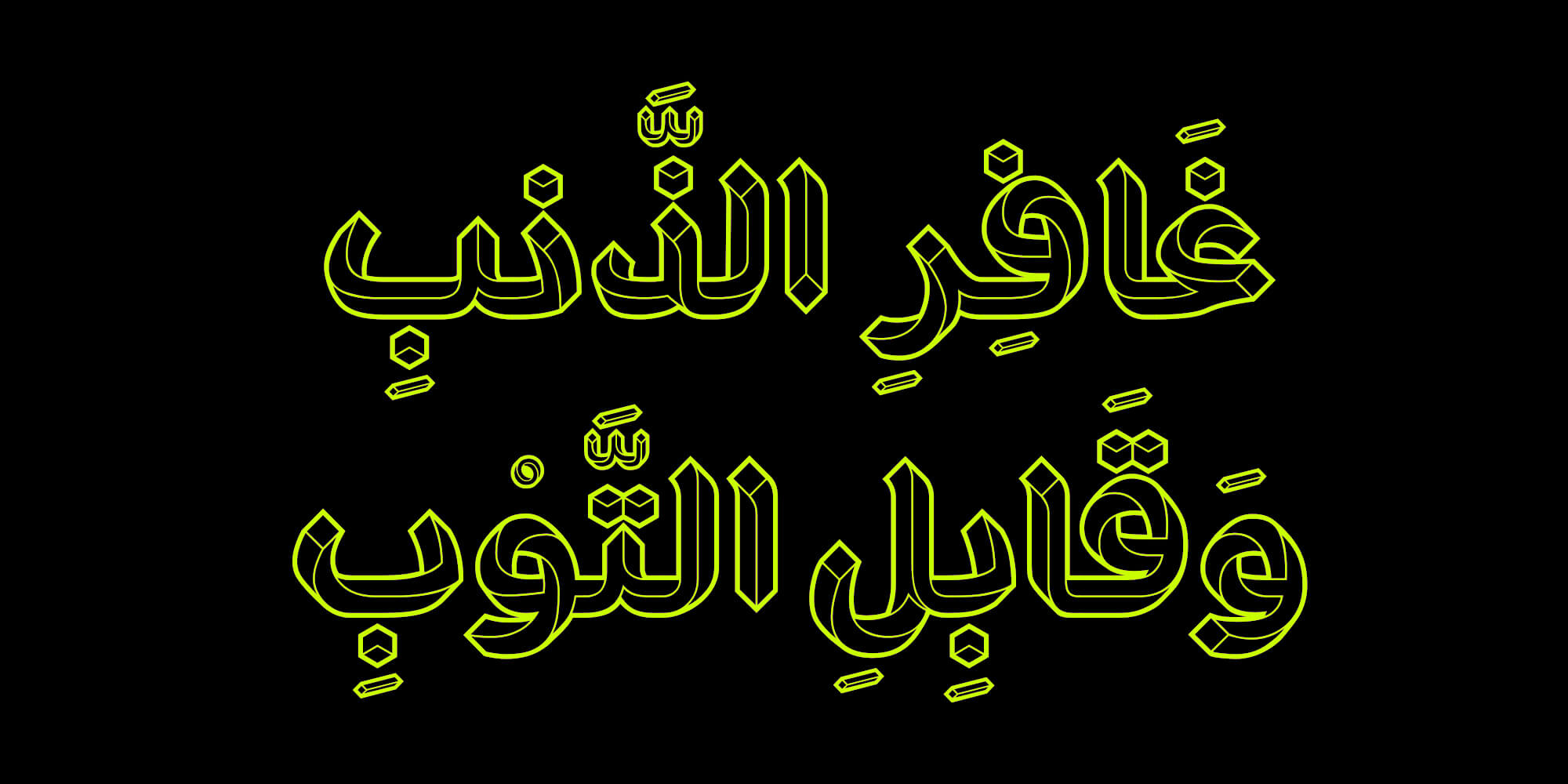


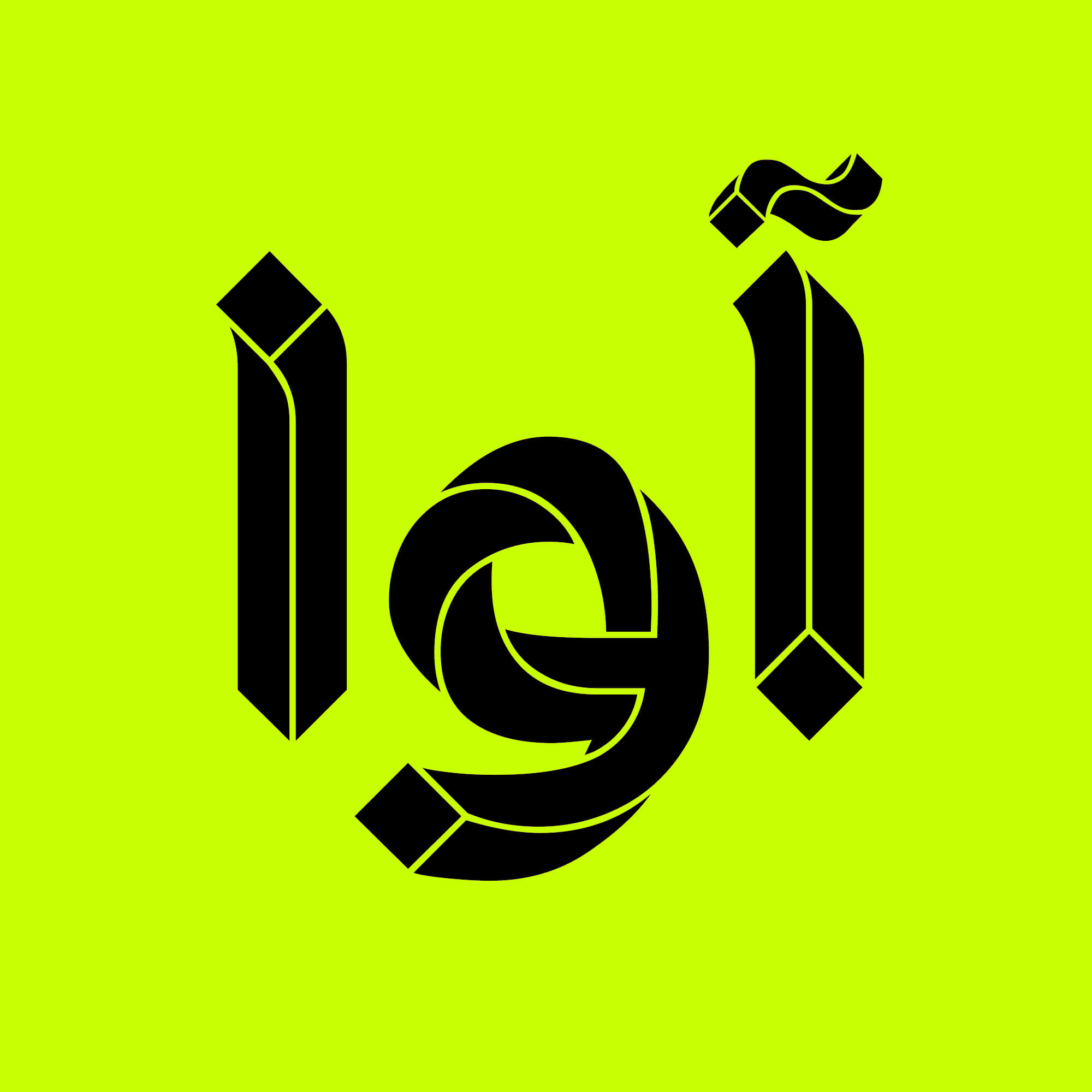

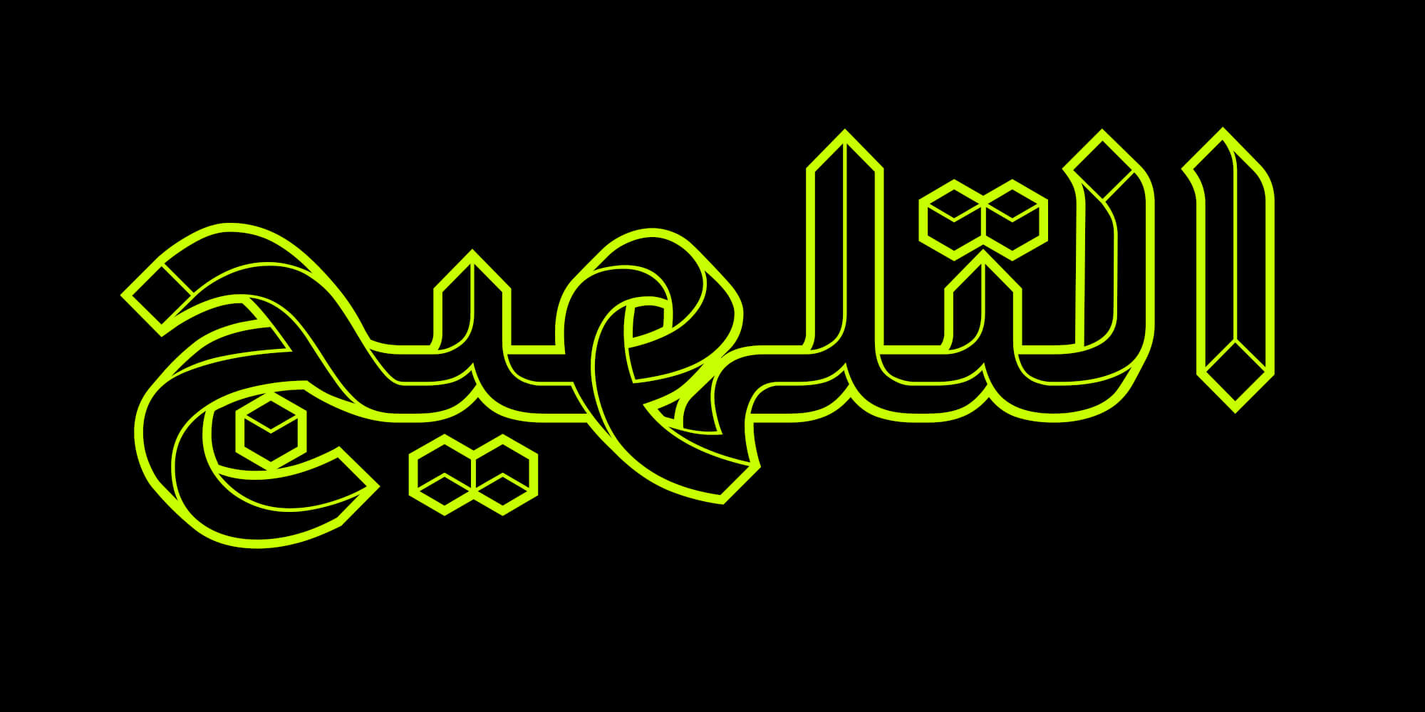
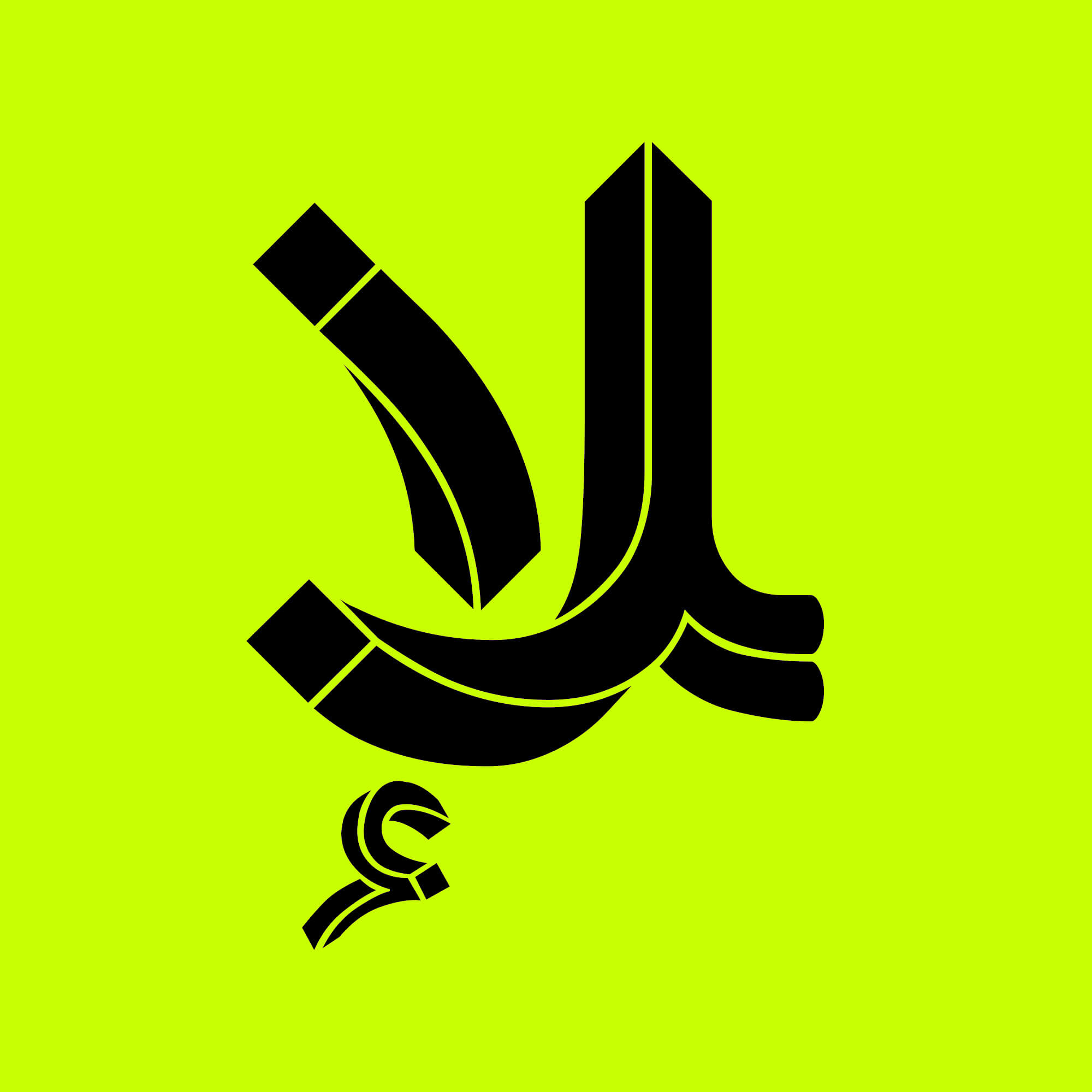

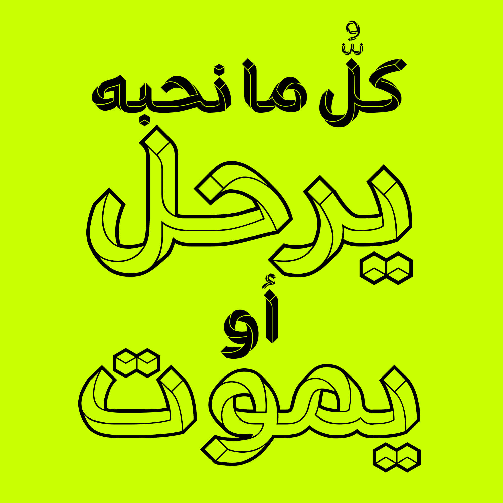

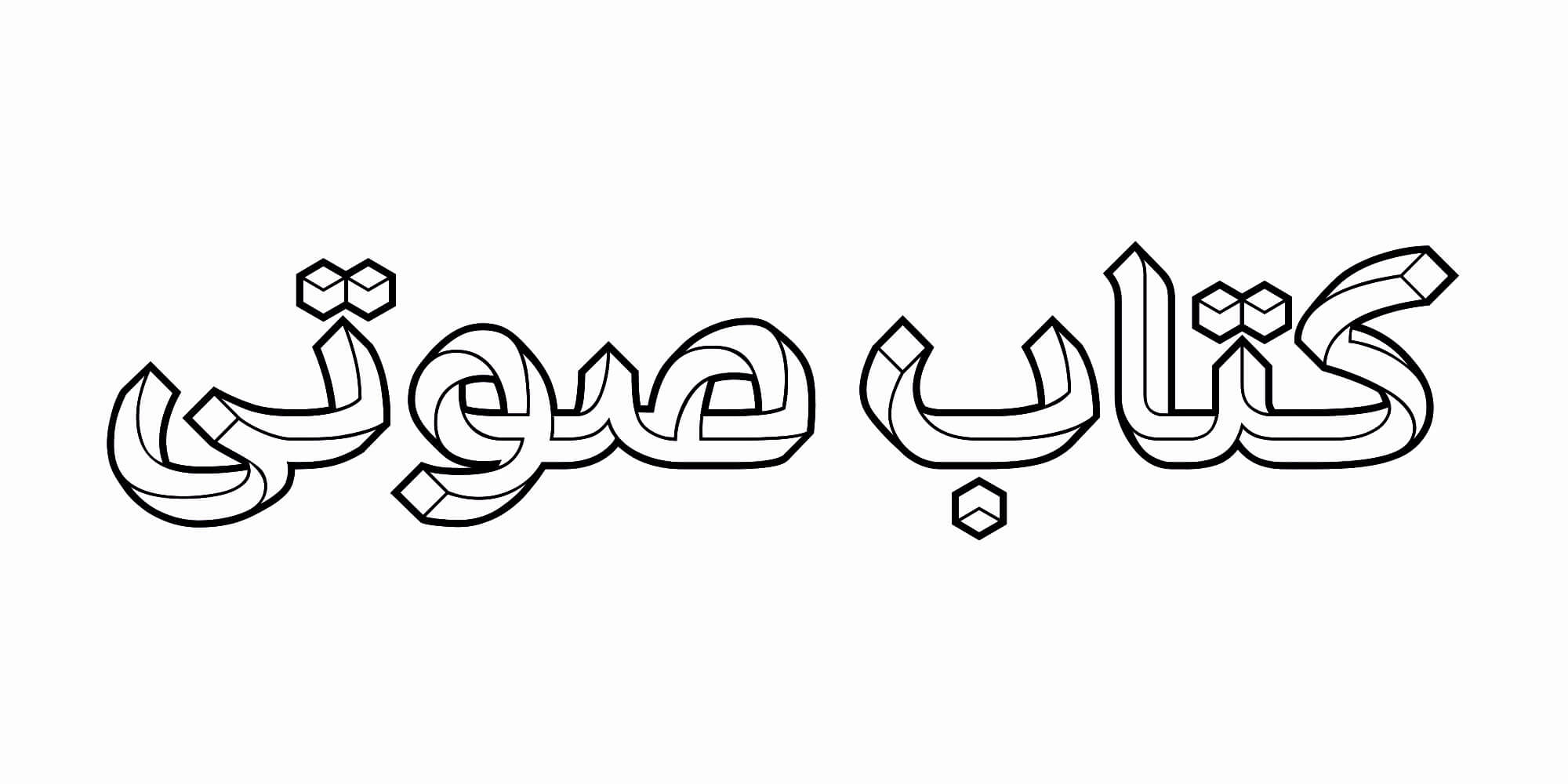


The Paradox font is an attractive and creative example in font design. This font creates a unique harmony by combining curved and sharp lines, depicting elegance and complexity. In this font, visual distortion is used as a design element to ensure a beautiful harmony among letters. With precise adjustment of visual distortion, letters in words are artistically combined, adding beauty and diversity to text design with the Paradox font.

Sample Alternate Characters
- Main Fonts: 2 styles in TTF format.
- Web Fonts: special fonts for use on websites in WOFF and WOFF2 formats.
Graduated in Graphic Design from the University of Art and Architecture University Master's degree in Graphic Design, Science and Research University


Comments
Frequently Asked Questions