Potk
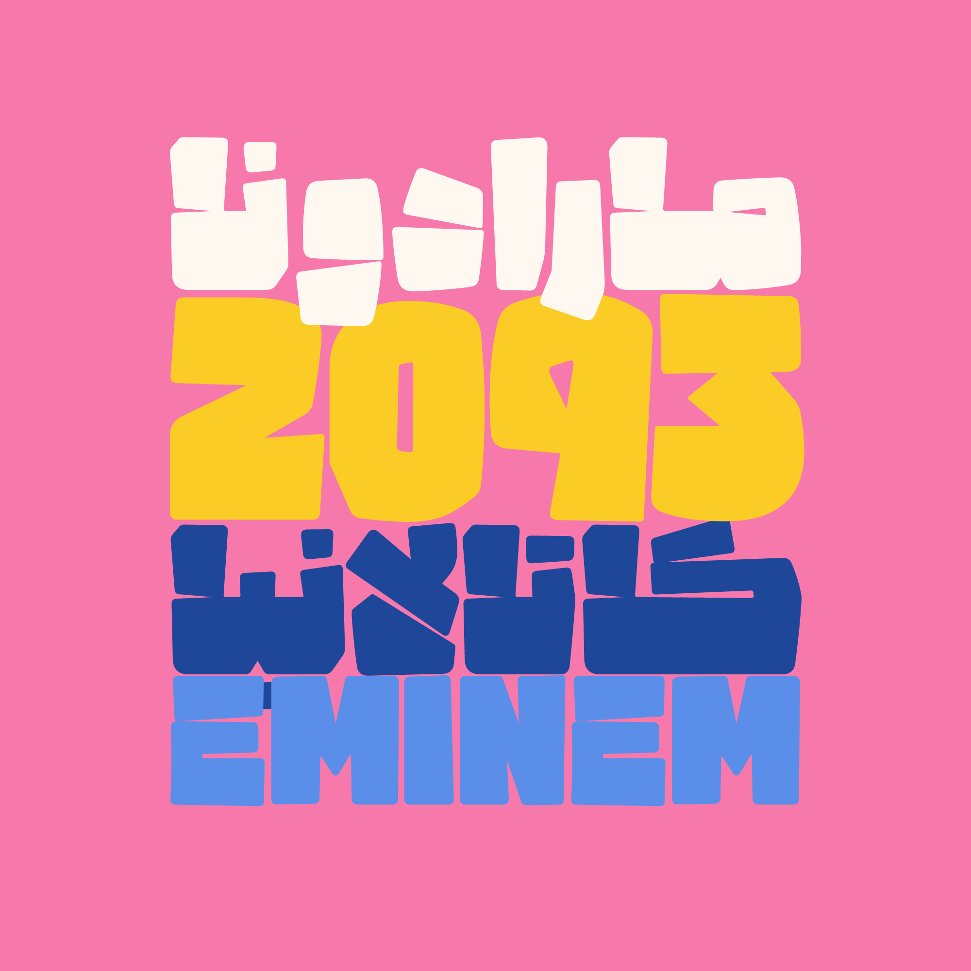
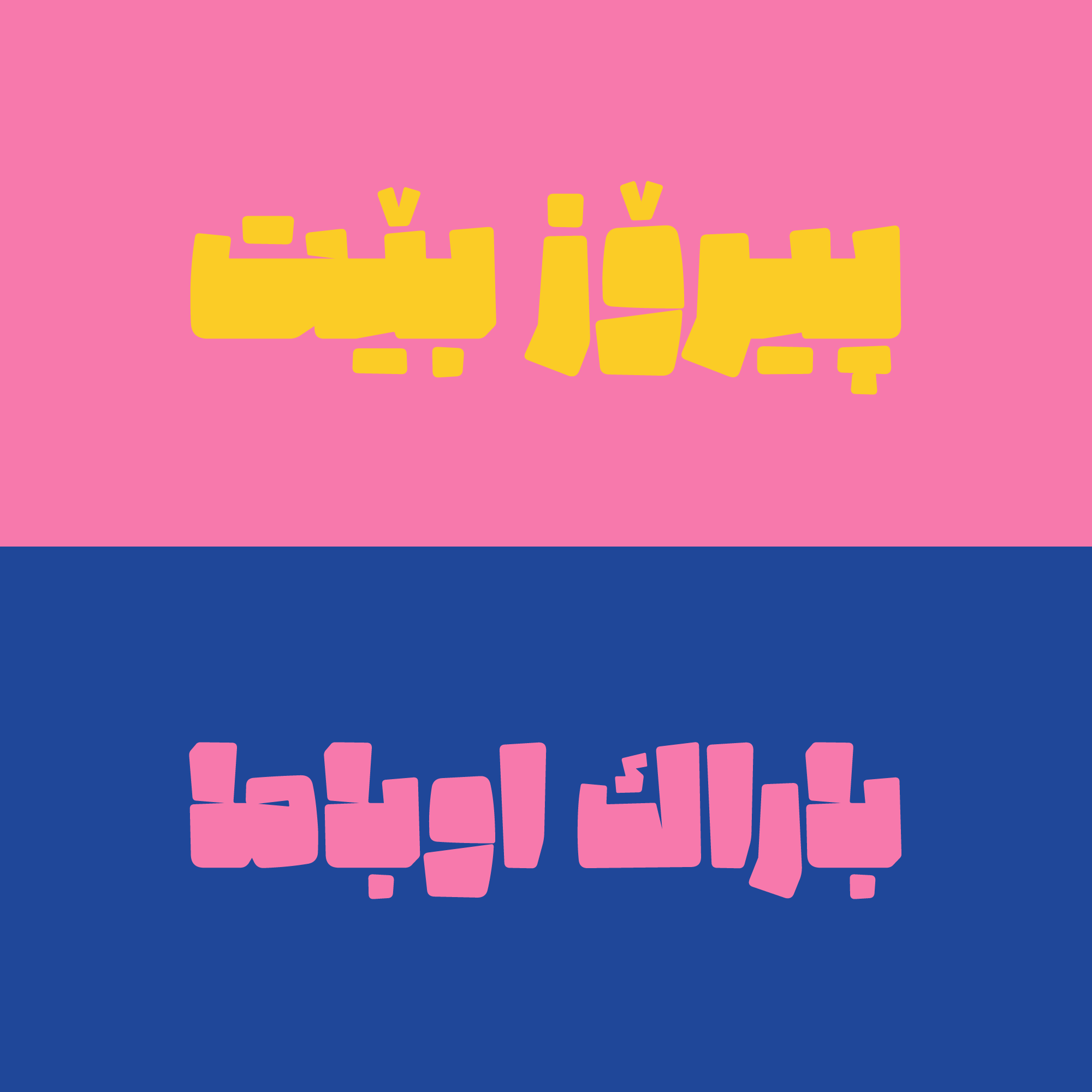
Beating anything with a Potk (it means sledgehammer) leads to changing forms, and doing so, with a meaningful purpose could turn things into unique forms.


It doesn’t matter what is being beaten by the Potk, the volume of the beats and the way it hammers is what matters. Hot metals, mine stones, cement blocks, and even letter’s forms can be changed.

Let’s imagine what letters would look like if a Potk strikes their bodies.
What if it applies a large force on the letters?
What would their physical appearance look like?


Some changes, like missing the white spaces and the counters, uneven thicknesses, accidental breaks of the strokes, changing of the sizes, diminishing rounded parts and the strokes, are what come out of this. Potk typeface is designed and optimized based on these changes and hammerings.
In the Potk package, you receive the following components:
- Main Fonts: Font files in ttf formats, offering 1 weight.
-
Web Fonts: Special fonts designed for web use, provided in woff and woff2 formats, accompanied by CSS code.
-
Guide: Instructions on using Stylistic Alternates, Discretionary Ligatures.
I am a member of Iranian Graphic Designers Society (IGDS) and I have bachelor of art in Graphic Design and I am engaged in type Design, Font Development and Logotype design. Working with letters always was, and still is such a joy for me. I think letters are like musical notes. We can have as many typefaces as we can make melodies.


Comments
Frequently Asked Questions